An element that pops up from another element over other content; it differs from a tooltip in that it is usually triggered via click instead of hover and can contain interactive elements.
Component
Popover
50 Examples (50 shown)
Filter:
-
Ant Design
Tech
- React
Features
- Code examples
- Accessibility issues
- Open source
-
Ant Design
Tech
- React
Features
- Code examples
- Accessibility issues
- Open source
-
Ariakit
Tech
- React
Features
- Code examples
- Open source
- Accessibility
-
Ariakit
Tech
- React
Features
- Code examples
- Open source
- Accessibility
-
Auro
Tech
- Web Components
- Sass
Features
- Code examples
- Usage guidelines
- Open source
-
Backpack
Tech
- Mobile
- React
Features
- Code examples
- Usage guidelines
- Open source
- Tone of voice
-
Base Web
Tech
- React
- CSS-in-JS
Features
- Code examples
- Usage guidelines
- Open source
-
Blueprint
Tech
- React
- Sass
Features
- Open source
-
Bolt Design System
Tech
- Sass
- Twig
- Web Components
Features
- Code examples
- Tone of voice
- Open source
-
Bootstrap
Tech
- Sass
Features
- Code examples
- Accessibility
- Open source
-
Carbon Design System
Tech
- React
- Vanilla JS
- Angular
- Vue
- Svelte
- Web Components
Features
- Code examples
- Usage guidelines
- Open source
-
Cauldron
Tech
- React
- CSS
Features
- Code examples
- Usage guidelines
- Accessibility
- Open source
-
Cedar
Tech
- Vue
- Sass
- CSS Modules
Features
- Usage guidelines
- Code examples
- Open source
-
Chakra UI
Tech
- React
- CSS-in-JS
Features
- Code examples
- Open source
-
Coral
Tech
- React
Features
- Code examples
- Tone of voice
- Open source
-
Crayons
Tech
- Web Components
Features
- Code examples
- Open source
-
Decathlon Design System
Tech
- CSS
- React
- Svelte
- Vue
- Web Components
Features
- Usage guidelines
- Code examples
- Accessibility
- Open source
-
Dell Design System
Tech
- Vanilla JS
Features
- Code examples
- Usage guidelines
-
eBay Playbook
Tech
- HTML
- React
Features
- Code examples
-
Elastic UI framework
Tech
- React
- CSS-in-JS
Features
- Code examples
- Open source
-
Elisa Design System
Tech
- React
Features
- Usage guidelines
- Code examples
- Accessibility
-
Evergreen
Tech
- React
Features
- Open source
-
Flowbite
Tech
- Tailwind CSS
Features
- Open source
- Code examples
-
Forma 36
Tech
- React
- CSS-in-JS
Features
- Code examples
- Open source
-
Gestalt
Tech
- React
- CSS
Features
- Code examples
- Open source
- Usage guidelines
-
Headless UI
Tech
- React
- Vue
Features
- Code examples
- Accessibility
- Open source
-
HeroUI
Tech
- React
- Tailwind CSS
Features
- Code examples
- Open source
-
Instructure-UI
Tech
- React
- CSS-in-JS
Features
- Code examples
- Accessibility
- Open source
-
Lightning Design System
Tech
- React
Features
- Code examples
- Usage guidelines
- Tone of voice
- Open source
-
Morningstar Product System
Tech
- Vue
Features
- Usage guidelines
-
NewsKit
Tech
- React
- CSS-in-JS
Features
- Code examples
- Usage guidelines
- Open source
-
Nord Design System
Tech
- Web Components
Features
- Code examples
- Usage guidelines
-
Orbit
Tech
- React
- CSS-in-JS
Features
- Usage guidelines
- Open source
- Code examples
- Tone of voice
-
Pajamas
Tech
- Vue
Features
- Usage guidelines
- Code examples
- Open source
-
Paste
Tech
- React
- CSS-in-JS
Features
- Usage guidelines
- Code examples
- Tone of voice
- Accessibility
- Open source
-
PatternFly
Tech
- React
- Sass
Features
- Tone of voice
- Open source
- Usage guidelines
-
Polaris
Tech
- React
Features
- Code examples
- Usage guidelines
- Accessibility
- Tone of voice
- Open source
-
Porsche Design System
Tech
- Web Components
- Angular
- React
- Vue
Features
- Code examples
- Open source
-
Primer
Tech
- React
Features
- Code examples
- Open source
-
Radix Primitives
Tech
- React
Features
- Code examples
- Open source
-
Red Hat design system
Tech
- Web Components
Features
- Code examples
- Usage guidelines
-
Ruter Components
Tech
- React
Features
- Code examples
- Unmaintained
-
Seeds
Tech
- React
Features
- Code examples
- Usage guidelines
- Tone of voice
-
shadcn/ui
Tech
- React
- Tailwind CSS
Features
- Code examples
- Open source
-
Spectrum
Tech
- CSS
- Web Components
- React
Features
- Code examples
- Usage guidelines
- Tone of voice
- Open source
-
Stacks
Tech
- Stimulus
Features
- Code examples
- Usage guidelines
- Tone of voice
- Open source
-
Thumbprint
Tech
- React
- Sass
Features
- Code examples
- Open source
-
Wanda
Tech
- React
- CSS Modules
Features
- Code examples
- Open source
-
Web Awesome
Tech
- Web Components
Features
- Open source
- Code examples
-
Wise Design
Tech
- Mobile
Features
- Usage guidelines
- Tone of voice
Description
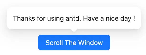
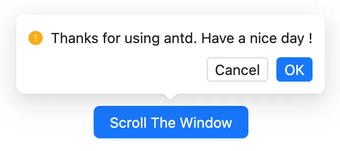
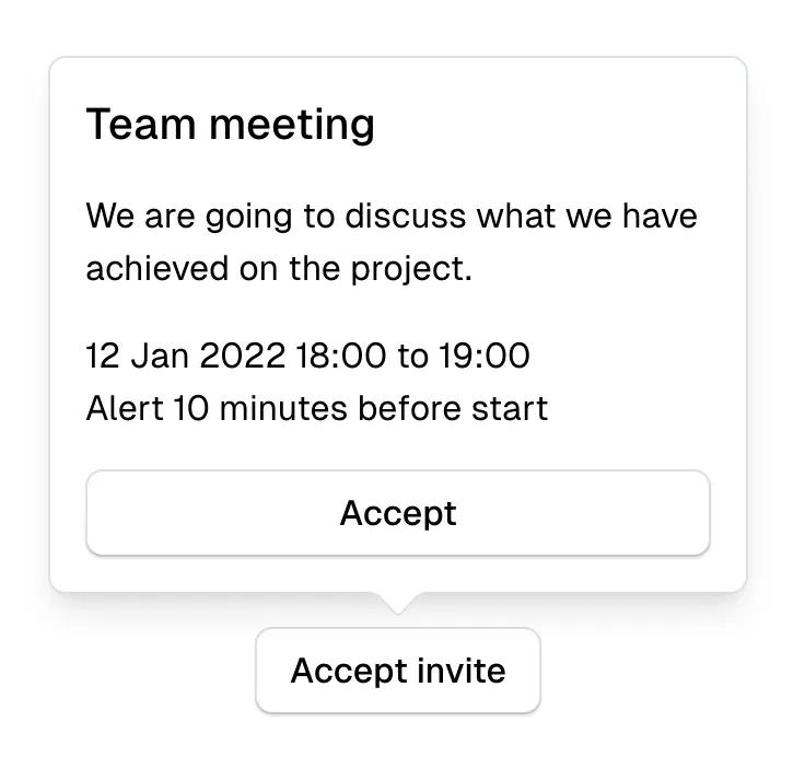
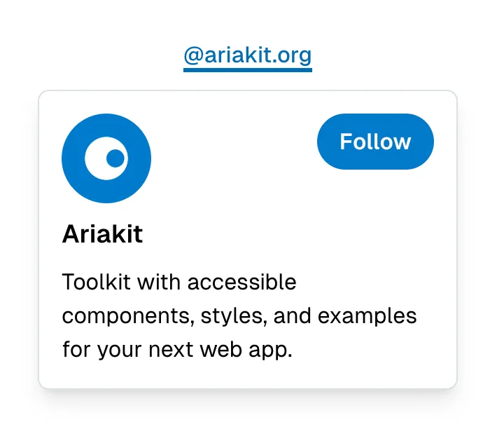
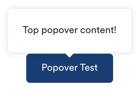
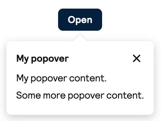
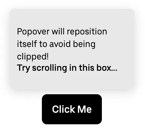
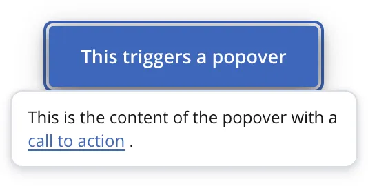
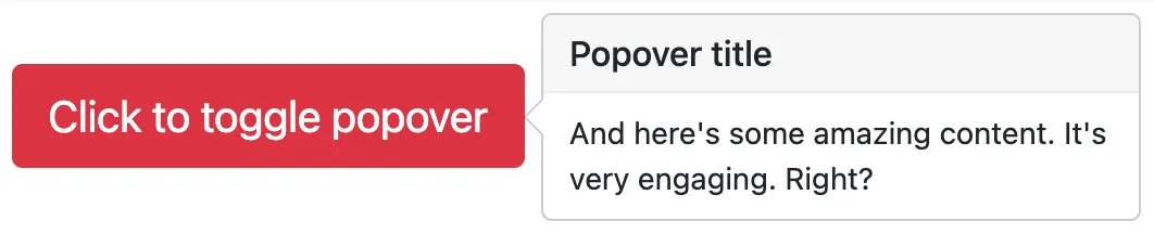
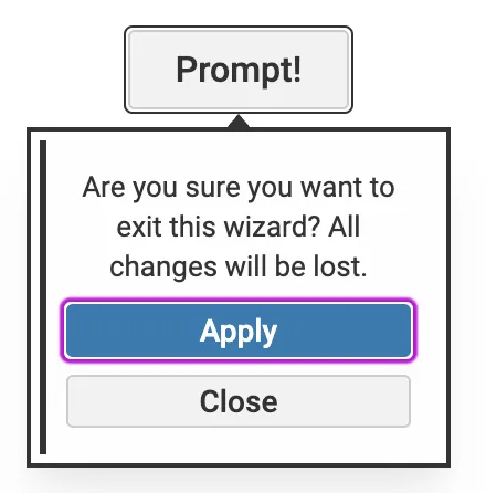
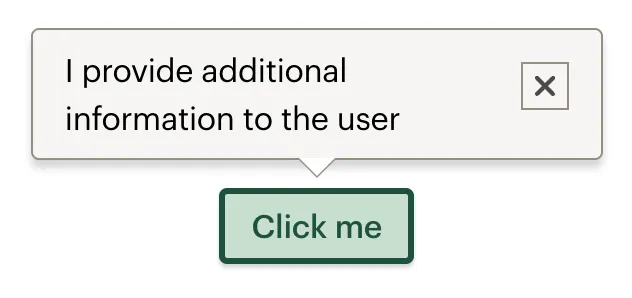
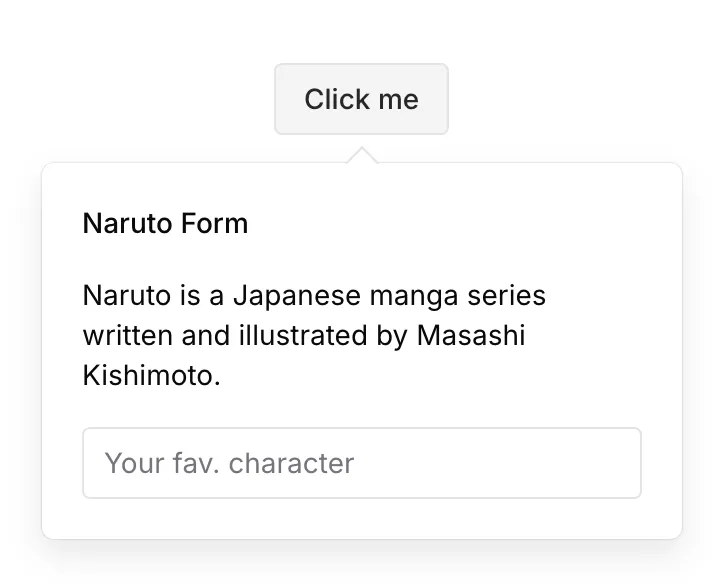
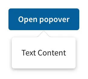
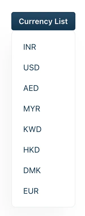
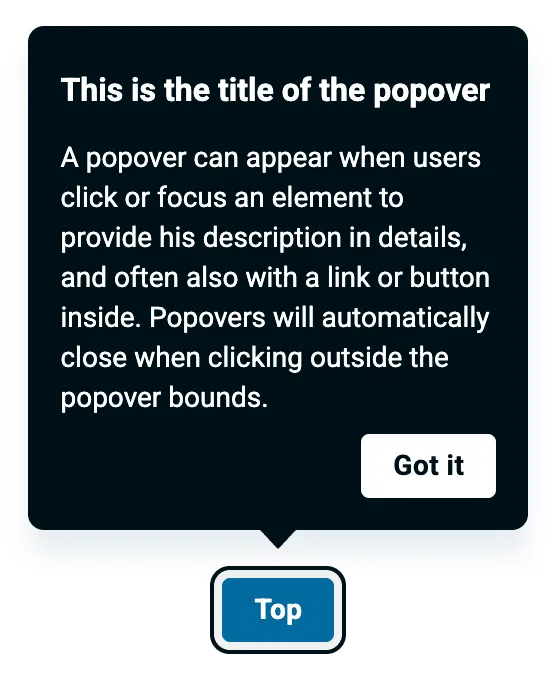
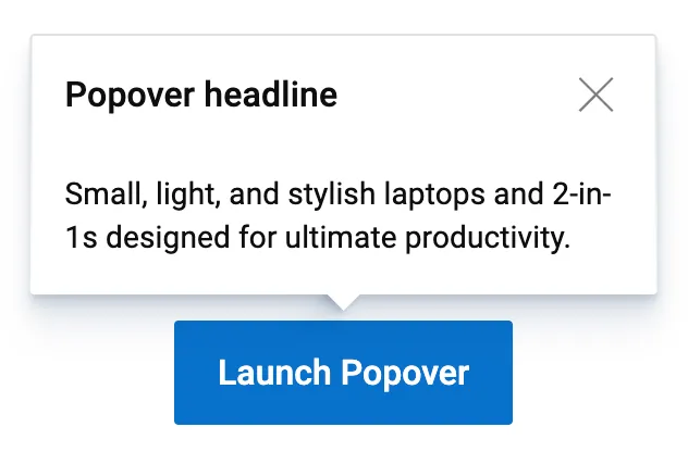
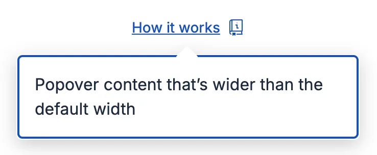
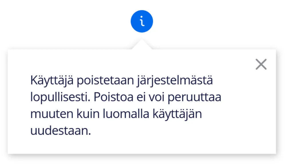
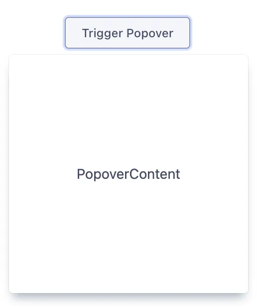
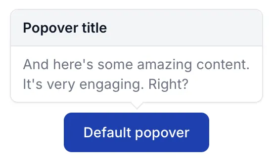
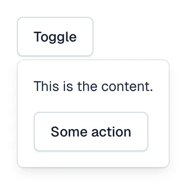
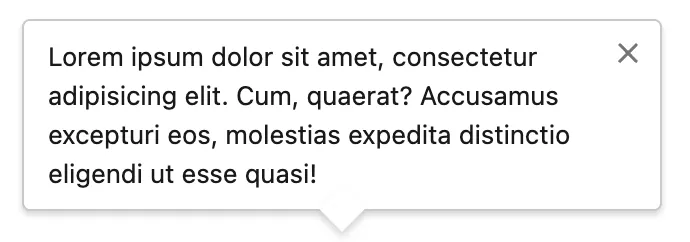
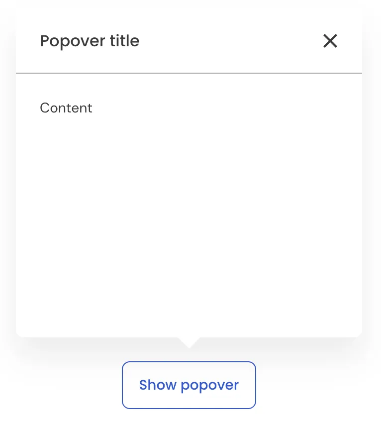
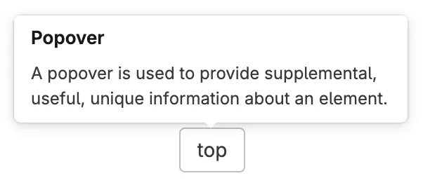
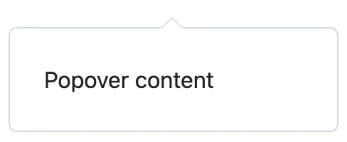
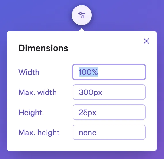
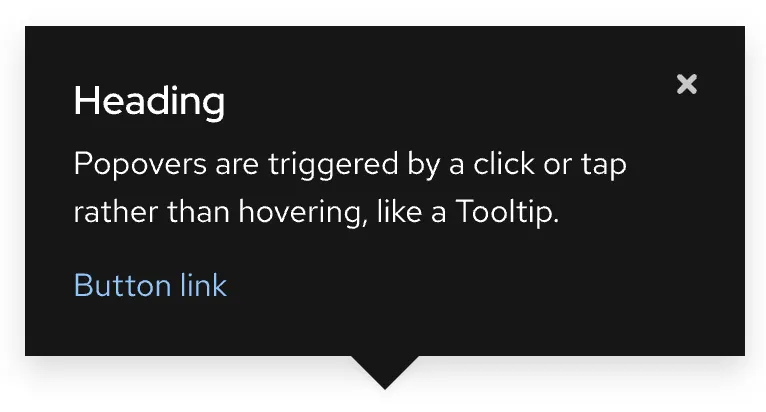
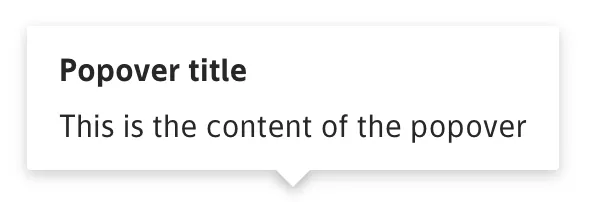
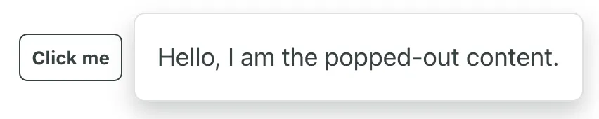
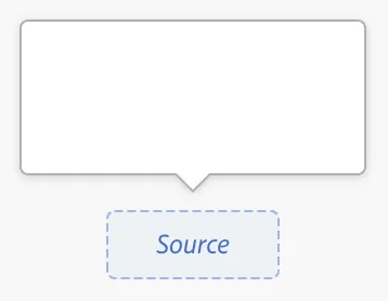
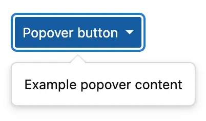
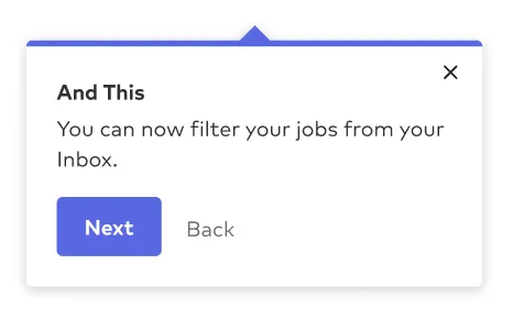
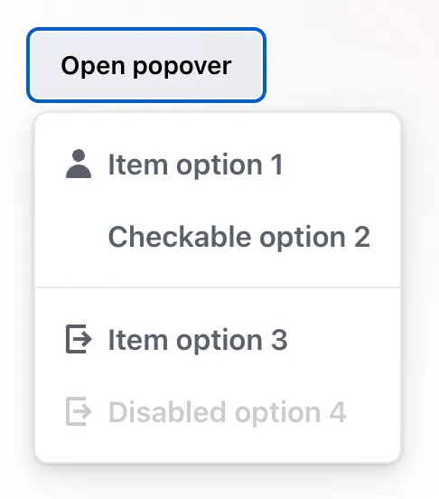
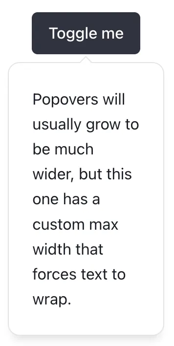
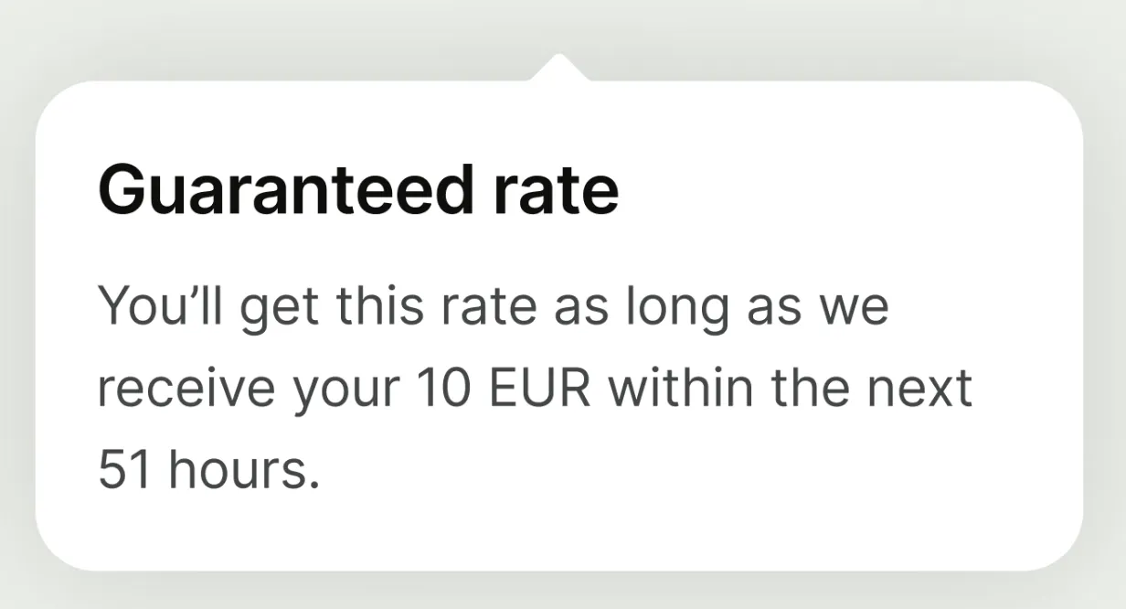
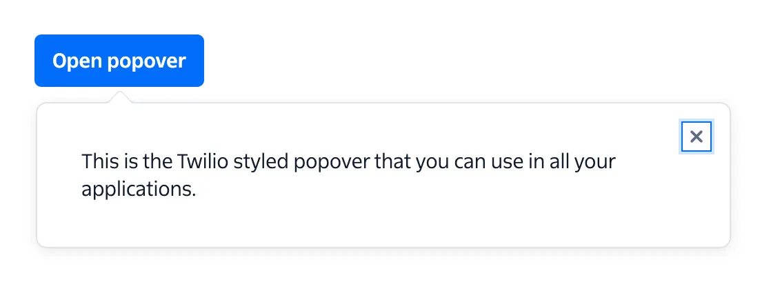
A popover is a wrapper for content that floats above other elements on the page. It is shown or hidden by interacting (usually clicking, but can also be on focus or hover) with a trigger element such as a button. The popover appears above, below, or to one side of this trigger element, often with a small triangle linking the two elements.
Note: In some cases, such as in Headless UI, the popover can be used as a primitive component for building other components like navigation menus. This article does not cover that use case.
Example markup
Here is some example markup for a popover trigger and popover in its closed state:
<!-- Popover trigger -->
<button
type="button"
aria-expanded="false"
aria-controls="popover"
aria-haspopup="dialog"
>
Expand Popover
</button>
<!-- Popover -->
<div id="popover" role="dialog" hidden>
<button type="button">Close popover</button>
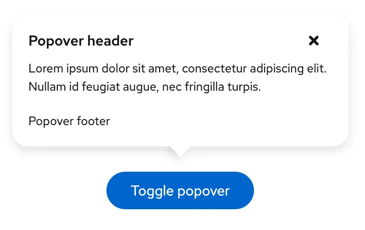
<header>This is the popover title</header>
<p>This is the popover body</p>
</div>In the open state, set the aria-expanded attribute on the popover trigger to false and remove the hidden attribute from the popover.
Interactivity
Opening the popover can be triggered using the click event on the button. This event will be triggered on mouse click, touch, and key press (Enter ↵ or Space).
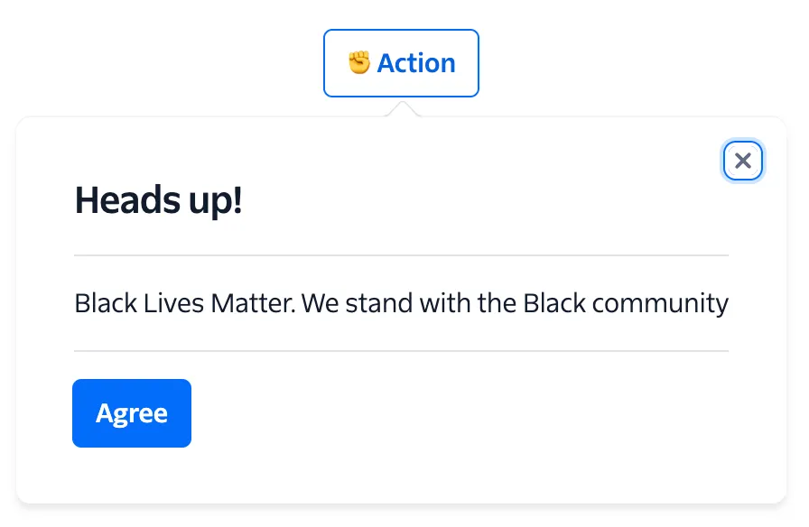
The popover should be closed whenever the user does any of the following actions:
- Presses the Esc key
- Presses a close button in the popover
- Clicks outside of the popover
Accessibility
Ensure that users can open, navigate, and close the popover using only a keyboard:
- When focused on the trigger button, Enter ↵ or Space should toggle display of the popover
- When the popover is expanded, Esc should close the popover and return focus to the trigger button
Ensure the popover trigger has an accessible label and communicates the popover’s state to assistive technologies:
- Use the
aria-expandedattribute on the trigger to indicate visibility of the popover - If your trigger does not have a visible text label, provide an
aria-labelor visually hidden label - Use the
aria-haspopupattribute on the trigger to indicate the type of interactive popup that this element triggers, usuallydialogormenu; this should match theroleof the popover. You can see all possible values here. - Use
aria-controlswith the value set to theidof the popover element
Ensure the popover content is hidden from assistive technologies when the popover is closed. Some possible ways of doing this include:
- Adding the
hiddenattribute - Adding the CSS property
display: noneorvisibility: hidden - Adding the
inertattribute - Adding the
aria-hidden="true"attribute (you may also need to set any interactive elements inside the popover as non-focusable usingtabindex="-1")
Ensure the popover content has the correct attributes:
- The
idshould match thearia-controlsattribute of the popover trigger. - The
roleshould match thearia-haspopupattribute on the popover trigger.
A note on the dialog role
If you’re using the dialog role on the popover, you need to decide whether the dialog is modal (only the content within the dialog can be interacted with) or non-modal (users can interact with content outside of the dialog).
For modal dialogs you will need to implement a focus trap to ensure that keyboard users can navigate through interactive elements in a logical and predictable order without inadvertently moving focus outside of the intended area.
Usage guidelines
-
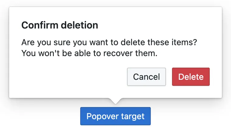
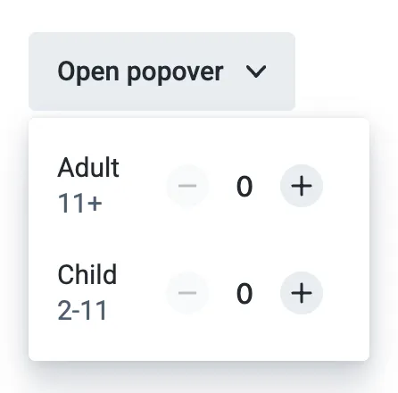
Because a popover is hidden by default, it should only contain non-critical information. If you have space to show this information outside a popover without cluttering your interface, you should do so. One possible use for a popover is to hide information that’s irrelevant once the user is familiar with an interface.
-
Keep the content inside your popovers short to prevent it being cut off on smaller screens (or needing an internal scrollbar).
-
The trigger for your popover should trigger your popover and nothing else. If you add popover functionality to an element which is already interactive (e.g. a link), the two actions will be triggered at the same time on touch devices. This might work for desktop users – those with a mouse or touchpad – but on touch devices, the focus, hover, and active states happen simultaneously.
Future developments
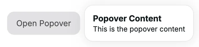
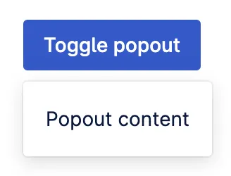
Since version 114, Chromium (the browser engine for Chrome and Edge amongst others) has included a Popover API designed to simplify the process of implementing popover components. This introduces new popovertarget and popover attributes.
<!-- Popover trigger -->
<button popovertarget="popover">Open Popover</button>
<!-- Popover -->
<div popover id="popover">Popover content</div>
The popover element is given the popover attribute and an id. The popover trigger is given the popovertarget attribute with its value matching the id of the popover element. Clicking on the popover trigger will now toggle the visibility of the popover element without any custom JavaScript.
Popovers created using the popover API are always non-modal.
At the time of writing, this is still an experimental technology so should not be used in production. Check the caniuse page for current browser support.
Related components
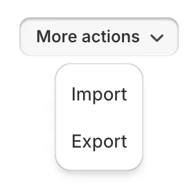
-
Select menu
A menu in which options are hidden by default but can be shown by interacting with a button; it differs from a select in that it shows actions or navigation options and is not a form input.
-
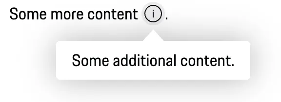
Toggletip
A means of displaying a description or extra information about an element, usually on hover, but can also be on click or tap.
Resources
-
UI Playbook
-
By Una Kravets
Chrome Developers
-
Open UI