Ratings let users see and/or set a star rating for a product or other item.
Component
Rating
19 Examples (19 shown)
Filter:
-

Ant Design
Tech
- React
Features
- Code examples
- Accessibility issues
- Open source
-

Backpack
Tech
- Mobile
- React
Features
- Code examples
- Usage guidelines
- Open source
- Tone of voice
-

Base Web
Tech
- React
- CSS-in-JS
Features
- Code examples
- Usage guidelines
- Open source
-
BBC Global Experience Language
Features
- Accessibility
- Usage guidelines
- Unmaintained
-

Cedar
Tech
- Vue
- Sass
- CSS Modules
Features
- Usage guidelines
- Code examples
- Open source
-

Chakra UI
Tech
- React
- CSS-in-JS
Features
- Code examples
- Open source
-

eBay MIND Patterns
Features
- Accessibility
- Usage guidelines
- Open source
-

Flowbite
Tech
- Tailwind CSS
Features
- Open source
- Code examples
-

Fluent UI
Tech
- React
- Web Components
- Mobile
Features
- Usage guidelines
- Code examples
- Accessibility
- Open source
-

Instructure-UI
Tech
- React
- CSS-in-JS
Features
- Code examples
- Accessibility
- Open source
-

Morningstar Product System
Tech
- Vue
Features
- Usage guidelines
-

Morningstar Product System
Tech
- Vue
Features
- Usage guidelines
-

Quasar Framework
Tech
- Vue
Features
- Accessibility issues
- Code examples
- Open source
-
Sainsbury's Design System
Tech
- React
- Sass
Features
- Usage guidelines
- Code examples
- Tone of voice
-

Shoelace
Tech
- Web Components
Features
- Code examples
- Open source
-

Spectrum
Tech
- CSS
- Web Components
- React
Features
- Code examples
- Usage guidelines
- Tone of voice
- Open source
-

Thumbprint
Tech
- React
- Sass
Features
- Code examples
- Open source
-

Wanda
Tech
- React
- CSS Modules
Features
- Code examples
- Open source
-

Web Awesome
Tech
- Web Components
Features
- Open source
- Code examples
Description
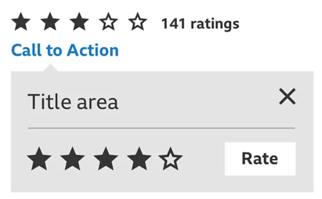
The rating component has two main functions:
- To display a single user’s, or an aggregate, star rating for a product, service, page, or other entity (non-interactive)
- To let users set their own star rating (interactive)
Depending on the individual use case, the component may need to perform both of these functions or just one of them.
Markup and Accessiblity
Displaying a rating
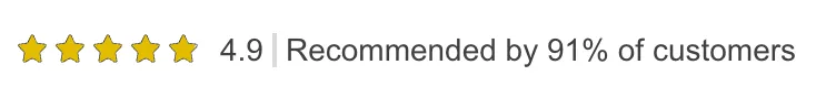
When displaying a non-interactive rating you should provide accessible text describing the rating. For example, by using an image with an alt attribute, Visually Hidden text, or an aria-label attribute. Consider also rendering these text labels visually, not only to users of assistive technologies; they can be especially useful when displaying fractions of stars. e.g. ‘4.2/5.0’.
Setting a rating
An interactive rating component can be seen as a series of radio inputs with the values 0, 1, 2, 3, 4, 5. By default, this provides the following keyboard pattern for keyboard interaction:
- Tab to focus on the rating component (and move focus onto the next interactive element when pressed again)
- →/↓ to increase the rating by one star
- ←/↑ to decrease the rating by one star
The behaviour of left and right arrows is logical, but you may choose to do what Adobe Spectrum’s rating component does and invert what the up and down arrows do: ↑ = +1 star and ↓ = -1 star.
In this example rating component from MUI both the input and the label for each option are visually hidden and a custom svg is shown instead.
Resources
-
By Nick Babich
UX Planet
-
UI Guideline
-
By Lea Verou