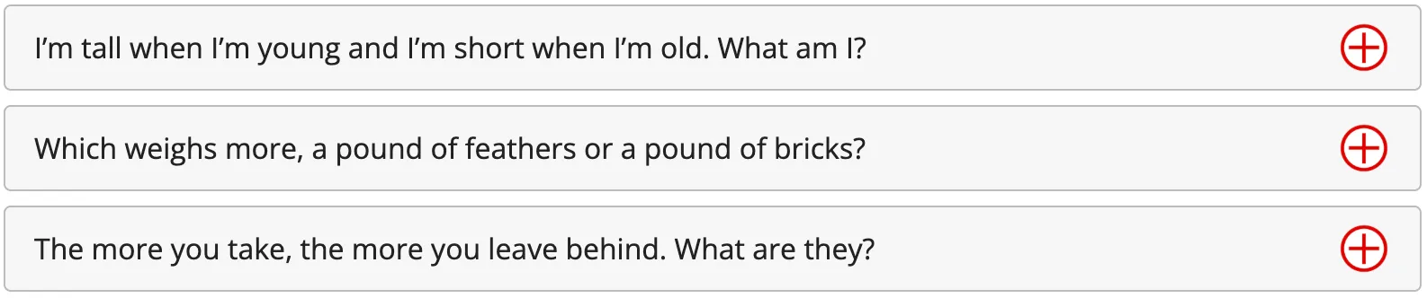
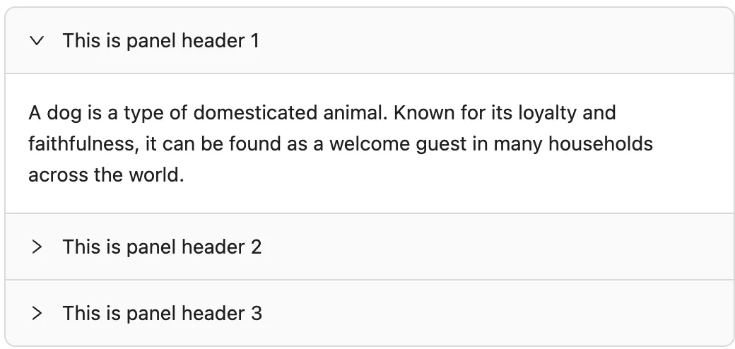
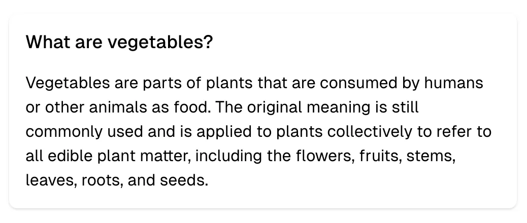
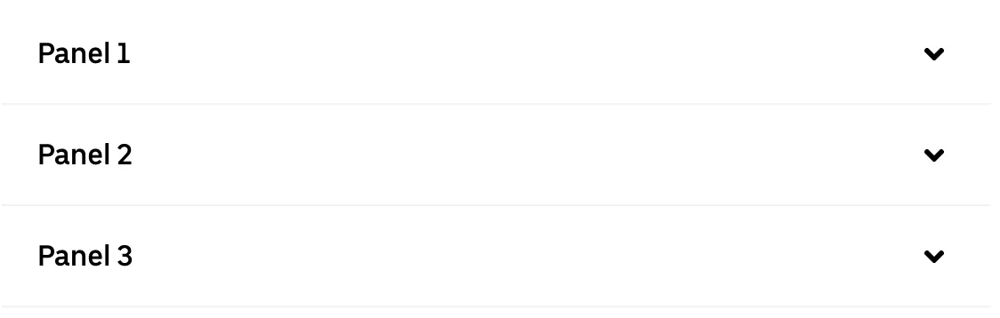
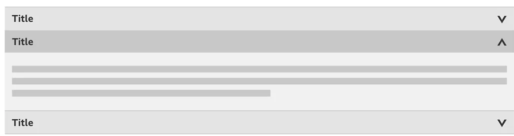
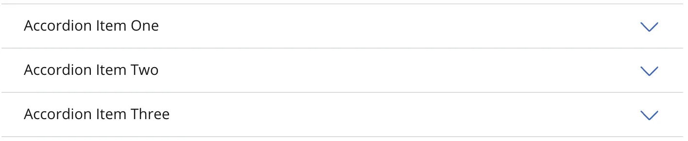
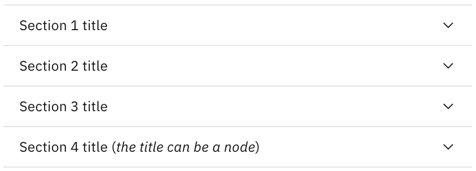
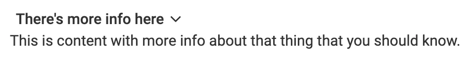
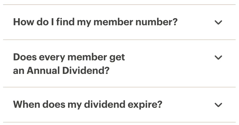
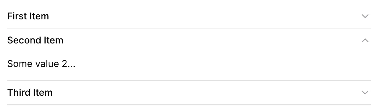
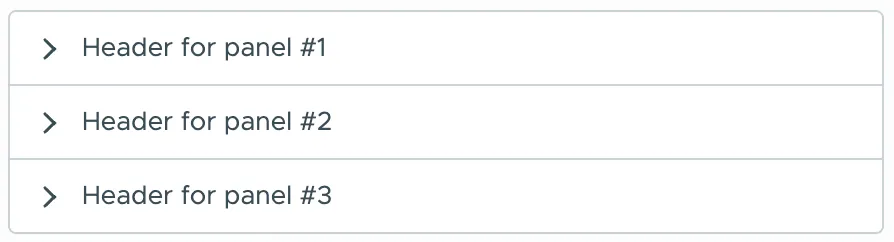
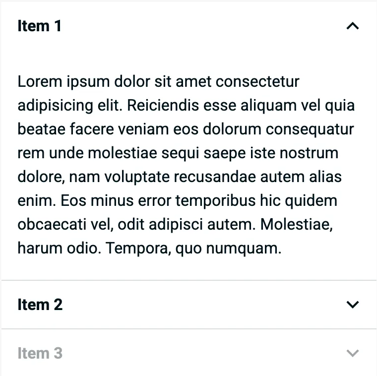
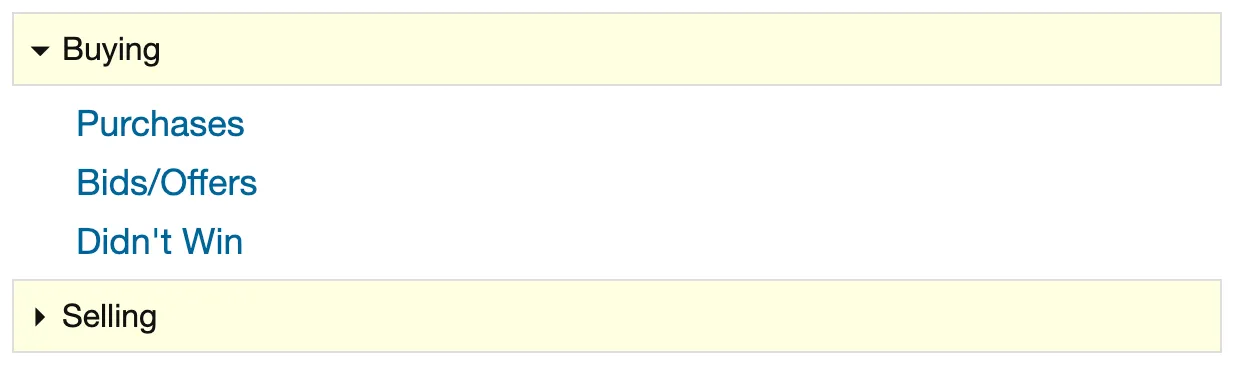
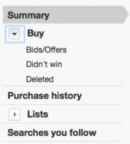
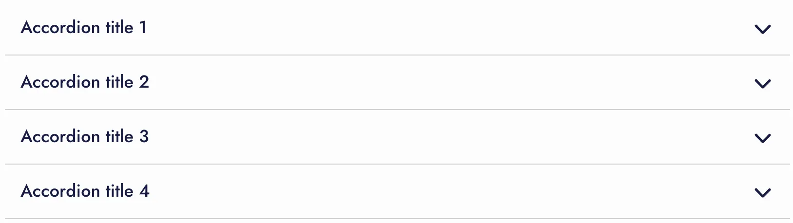
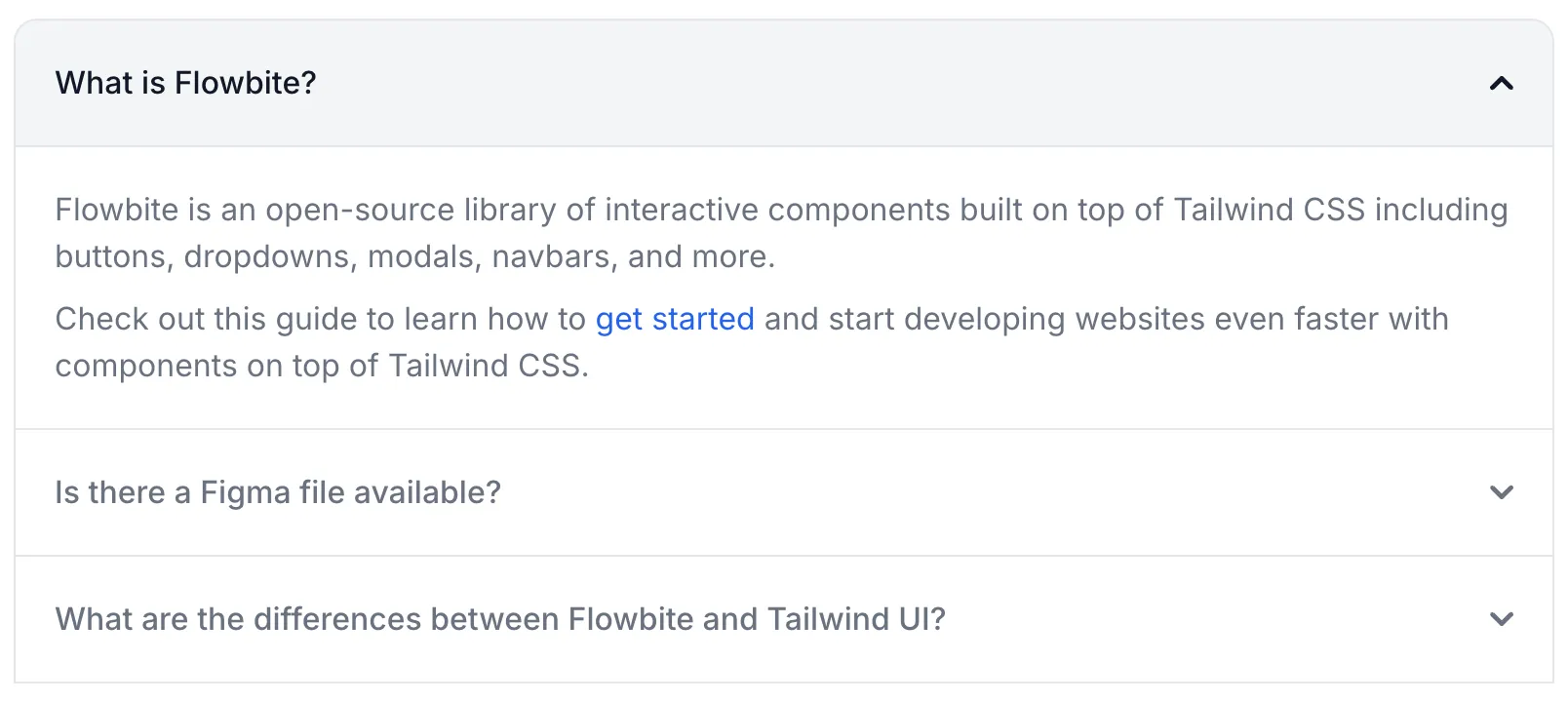
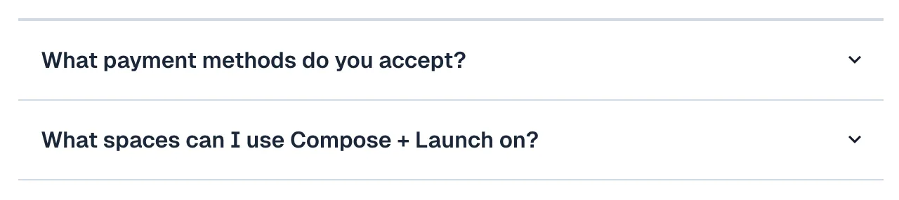
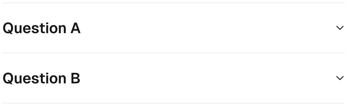
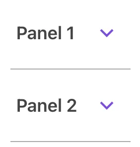
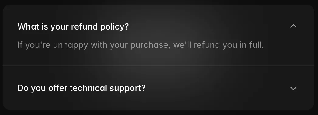
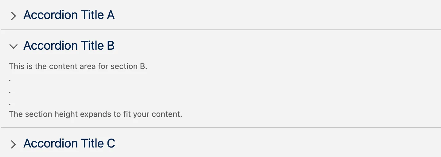
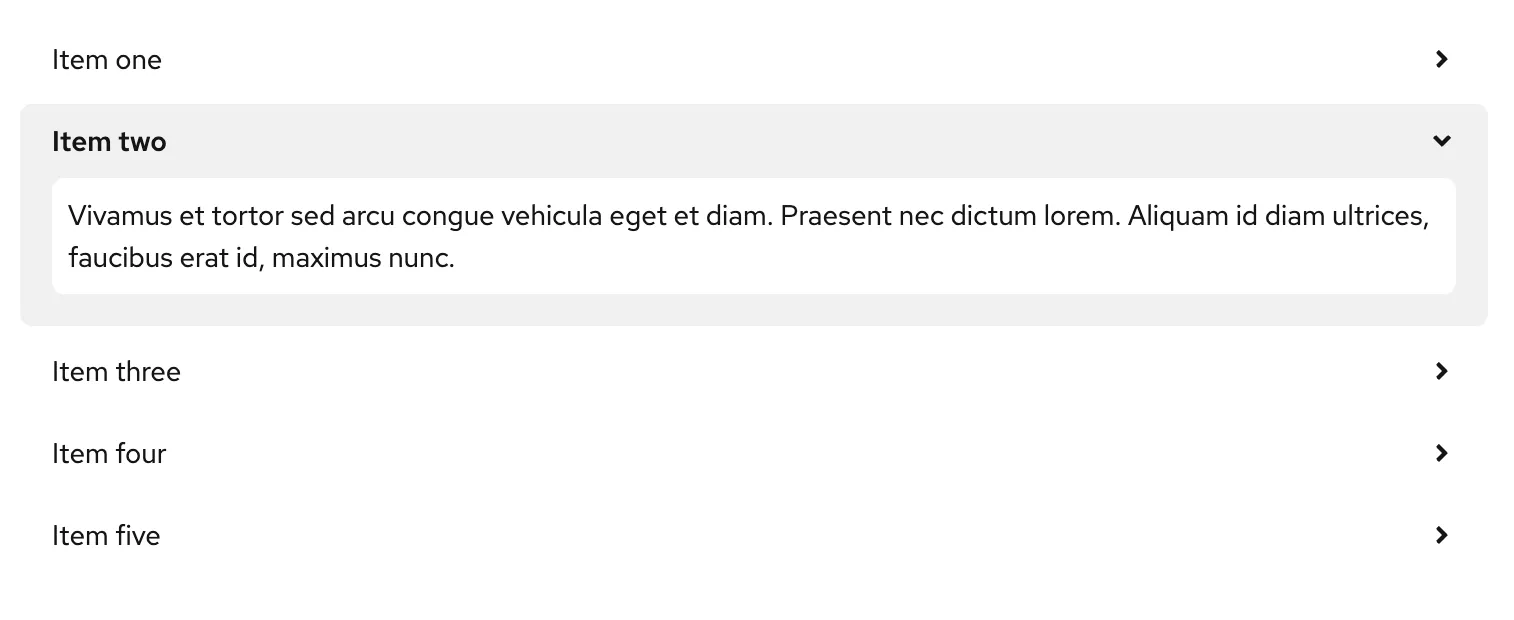
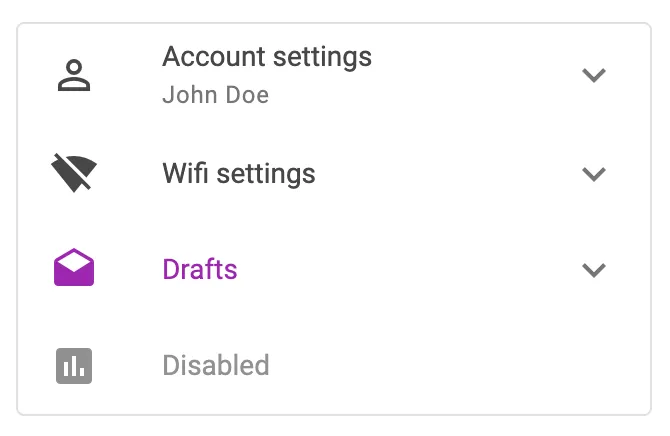
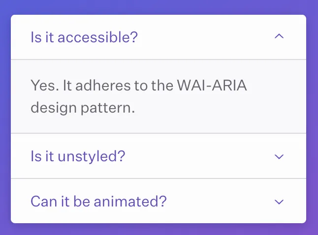
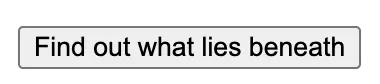
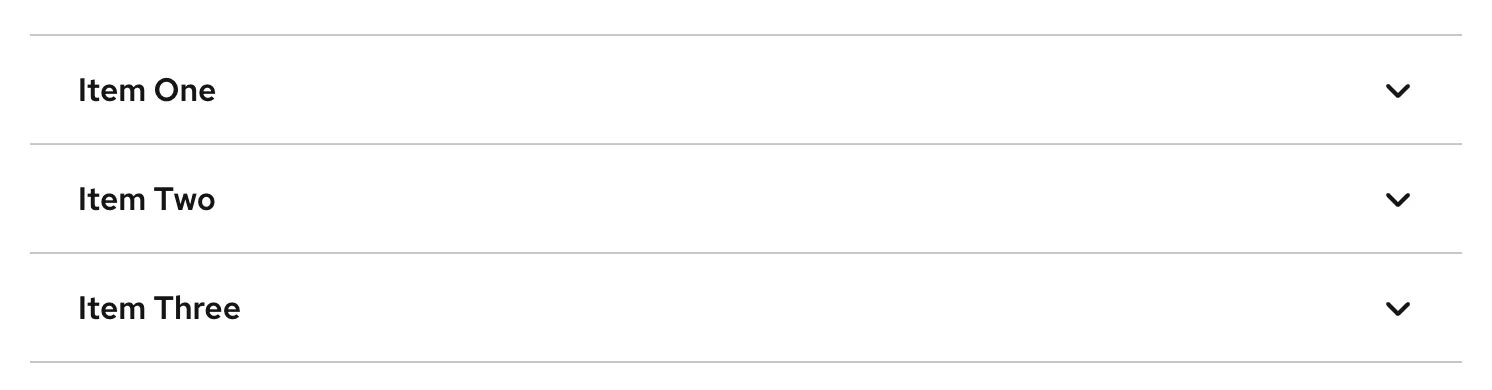
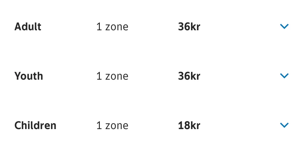
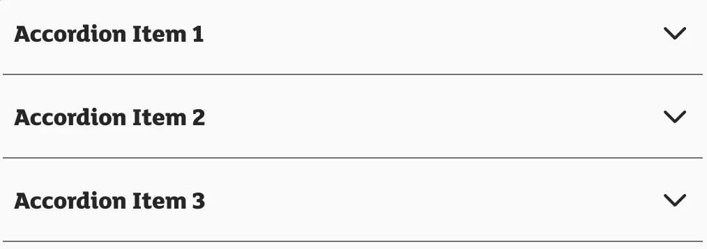
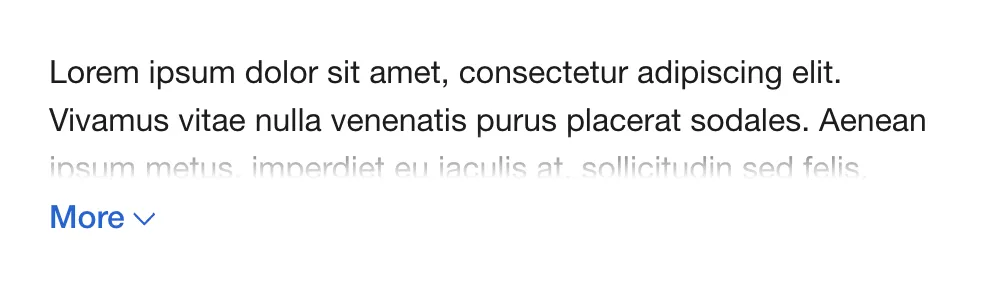
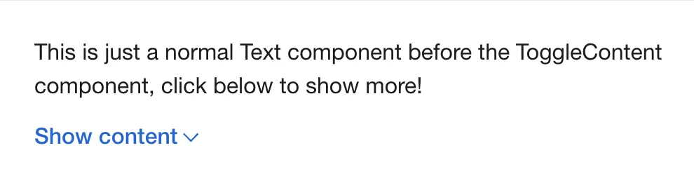
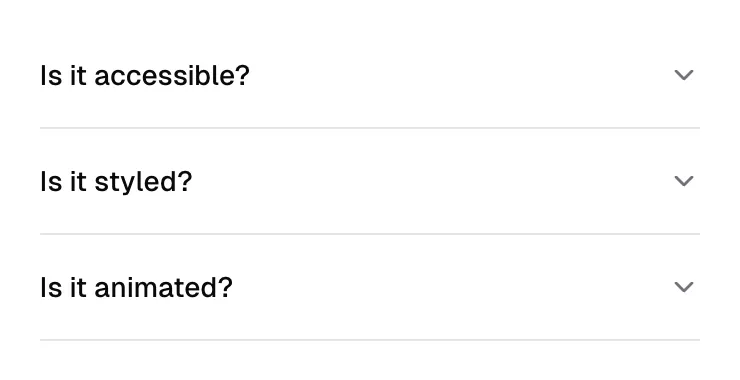
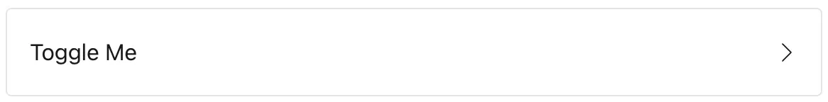
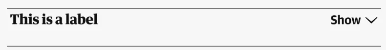
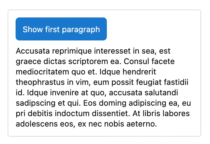
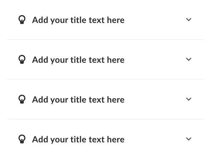
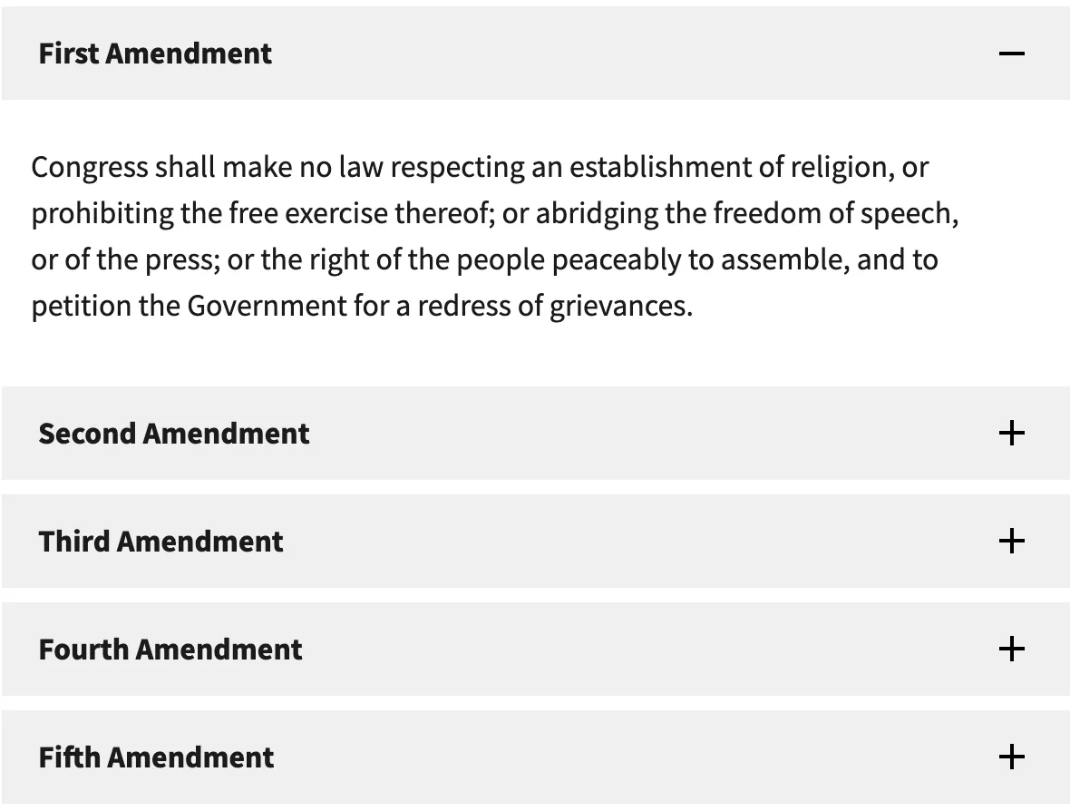
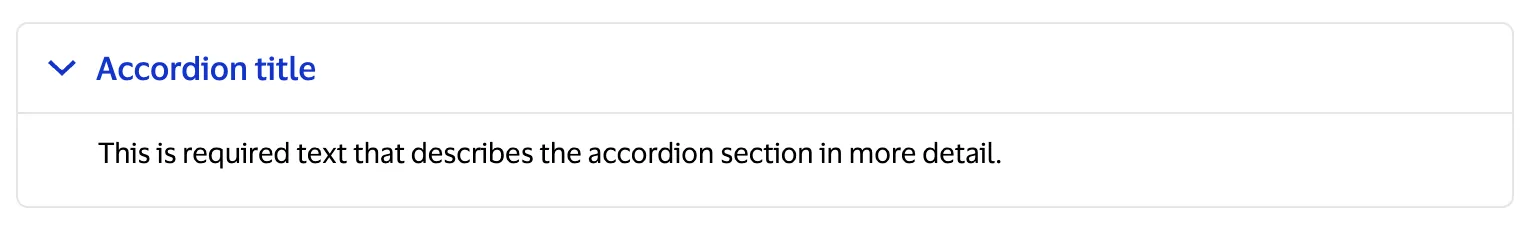
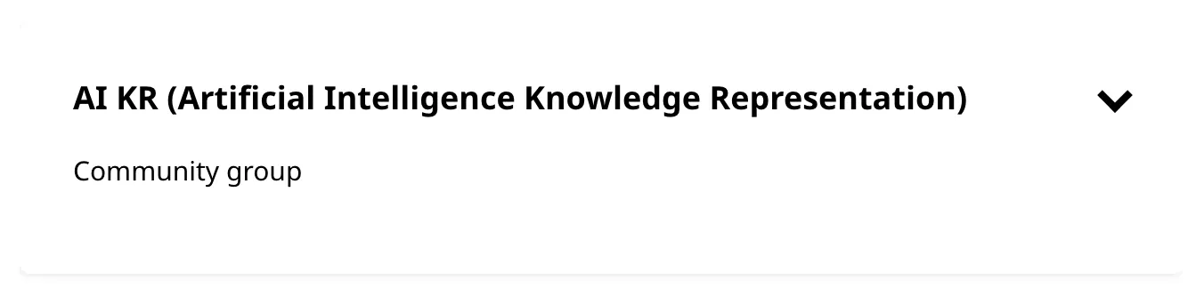
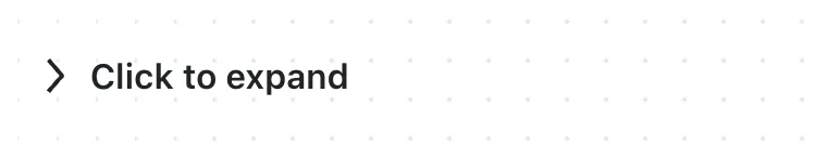
An accordion is a vertical stack of interactive headings used to toggle the display of further information; each item can be 'collapsed' with just a short label visible or 'expanded' to show the full content.
Component
Accordion
Also known as: Arrow toggle, Collapse, Collapsible sections, Collapsible, Details, Disclosure, Expandable, Expander, ShowyHideyThing
101 Examples (101 shown)
Filter:
-
A11Y Style Guide
Tech
- jQuery
Features
- Code examples
- Usage guidelines
- Accessibility
- Unmaintained
- Open source
-
Ant Design
Tech
- React
Features
- Code examples
- Accessibility issues
- Open source
-
Ariakit
Tech
- React
Features
- Code examples
- Open source
- Accessibility
-
Auro
Tech
- Web Components
- Sass
Features
- Code examples
- Usage guidelines
- Open source
-
Backpack
Tech
- Mobile
- React
Features
- Code examples
- Usage guidelines
- Open source
- Tone of voice
-
Base Web
Tech
- React
- CSS-in-JS
Features
- Code examples
- Usage guidelines
- Open source
-
BBC Global Experience Language
Features
- Accessibility
- Usage guidelines
- Unmaintained
-
Blueprint
Tech
- React
- Sass
Features
- Open source
-
Bolt Design System
Tech
- Sass
- Twig
- Web Components
Features
- Code examples
- Tone of voice
- Open source
-
Bootstrap
Tech
- Sass
Features
- Code examples
- Accessibility
- Open source
-

Brighton & Hove City Council Website pattern library
Features
- Unmaintained
-
Carbon Design System
Tech
- React
- Vanilla JS
- Angular
- Vue
- Svelte
- Web Components
Features
- Code examples
- Usage guidelines
- Open source
-
Cauldron
Tech
- React
- CSS
Features
- Code examples
- Usage guidelines
- Accessibility
- Open source
-
Cauldron
Tech
- React
- CSS
Features
- Code examples
- Usage guidelines
- Accessibility
- Open source
-
Cedar
Tech
- Vue
- Sass
- CSS Modules
Features
- Usage guidelines
- Code examples
- Open source
-
Chakra UI
Tech
- React
- CSS-in-JS
Features
- Code examples
- Open source
-
Chakra UI
Tech
- React
- CSS-in-JS
Features
- Code examples
- Open source
-
Clarity Design System
Tech
- CSS
- Angular
- Web Components
Features
- Code examples
- Usage guidelines
- Open source
-
Clarity Design System
Tech
- CSS
- Angular
- Web Components
Features
- Code examples
- Usage guidelines
- Open source
-
Coral
Tech
- React
Features
- Code examples
- Tone of voice
- Open source
-
Crayons
Tech
- Web Components
Features
- Code examples
- Open source
-
Decathlon Design System
Tech
- CSS
- React
- Svelte
- Vue
- Web Components
Features
- Usage guidelines
- Code examples
- Accessibility
- Open source
-
Dell Design System
Tech
- Vanilla JS
Features
- Code examples
- Usage guidelines
-

Dell Design System
Tech
- Vanilla JS
Features
- Code examples
- Usage guidelines
-
eBay MIND Patterns
Features
- Accessibility
- Usage guidelines
- Open source
-
eBay MIND Patterns
Features
- Accessibility
- Usage guidelines
- Open source
-
eBay Playbook
Tech
- HTML
- React
Features
- Code examples
-
Elastic UI framework
Tech
- React
- CSS-in-JS
Features
- Code examples
- Open source
-
Elisa Design System
Tech
- React
Features
- Usage guidelines
- Code examples
- Accessibility
-
Flowbite
Tech
- Tailwind CSS
Features
- Open source
- Code examples
-
Forma 36
Tech
- React
- CSS-in-JS
Features
- Code examples
- Open source
-
Geist Design System
Tech
- React
Features
- Code examples
-
generic-components
Tech
- Web Components
Features
- Code examples
- Accessibility
- Open source
-

generic-components
Tech
- Web Components
Features
- Code examples
- Accessibility
- Open source
-
Gestalt
Tech
- React
- CSS
Features
- Code examples
- Open source
- Usage guidelines
-
giffgaff design system
Features
- Usage guidelines
- Code examples
-
GOLD Design System
Tech
- React
- Sass
Features
- Code examples
- Usage guidelines
- Accessibility
- Open source
- Unmaintained
-
GOV.UK Design System
Tech
- Nunjucks
Features
- Code examples
- Usage guidelines
- Research
- Open source
-
GOV.UK Design System
Tech
- Nunjucks
Features
- Code examples
- Usage guidelines
- Research
- Open source
-
Grommet
Tech
- React
Features
- Code examples
- Open source
-
Headless UI
Tech
- React
- Vue
Features
- Code examples
- Accessibility
- Open source
-
Helsinki Design System
Tech
- React
- CSS
Features
- Code examples
- Usage guidelines
- Accessibility
- Open source
-
HeroUI
Tech
- React
- Tailwind CSS
Features
- Code examples
- Open source
-
Inclusive Components
Features
- Code examples
- Accessibility
- Unmaintained
-
Instructure-UI
Tech
- React
- CSS-in-JS
Features
- Code examples
- Accessibility
- Open source
-
Instructure-UI
Tech
- React
- CSS-in-JS
Features
- Code examples
- Accessibility
- Open source
-
Jøkul Designsystem
Tech
- React
- Sass
Features
- Code examples
- Usage guidelines
- Open source
-
Jøkul Designsystem
Tech
- React
- Sass
Features
- Code examples
- Usage guidelines
- Open source
-
Lightning Design System
Tech
- React
Features
- Code examples
- Usage guidelines
- Tone of voice
- Open source
-
Lightning Design System
Tech
- React
Features
- Code examples
- Usage guidelines
- Tone of voice
- Open source
-
Lightning Design System
Tech
- React
Features
- Code examples
- Usage guidelines
- Tone of voice
- Open source
-
Mozilla Protocol
Tech
- Handlebars
- Sass
Features
- Usage guidelines
- Open source
-
Mozilla Protocol
Tech
- Handlebars
- Sass
Features
- Usage guidelines
- Open source
-

Nessie
Tech
- Web Components
- Tailwind CSS
Features
- Usage guidelines
- Code examples
-
NewsKit
Tech
- React
- CSS-in-JS
Features
- Code examples
- Usage guidelines
- Open source
-

NHS Digital service manual
Tech
- Nunjucks
Features
- Code examples
- Usage guidelines
- Research
- Tone of voice
- Open source
-

NHS Digital service manual
Tech
- Nunjucks
Features
- Code examples
- Usage guidelines
- Research
- Tone of voice
- Open source
-
Nucleus Design System
Tech
- Web Components
Features
- Usage guidelines
-
Nucleus Design System
Tech
- Web Components
Features
- Usage guidelines
-
ONS Design System
Tech
- HTML
- Nunjucks
- Sass
Features
- Code examples
- Usage guidelines
- Accessibility
- Open source
-
ONS Design System
Tech
- HTML
- Nunjucks
- Sass
Features
- Code examples
- Usage guidelines
- Accessibility
- Open source
-
Ontario Design System
Tech
- HTML
- Sass
Features
- Code examples
- Usage guidelines
- Accessibility
-

Orbit
Tech
- React
- CSS-in-JS
Features
- Usage guidelines
- Open source
- Code examples
- Tone of voice
-

Orbit
Tech
- React
- CSS-in-JS
Features
- Usage guidelines
- Open source
- Code examples
- Tone of voice
-
Pajamas
Tech
- Vue
Features
- Usage guidelines
- Code examples
- Open source
-

Paste
Tech
- React
- CSS-in-JS
Features
- Usage guidelines
- Code examples
- Tone of voice
- Accessibility
- Open source
-
PatternFly
Tech
- React
- Sass
Features
- Tone of voice
- Open source
- Usage guidelines
-

PatternFly
Tech
- React
- Sass
Features
- Tone of voice
- Open source
- Usage guidelines
-
Porsche Design System
Tech
- Web Components
- Angular
- React
- Vue
Features
- Code examples
- Open source
-
Primer
Tech
- React
Features
- Code examples
- Open source
-
Quasar Framework
Tech
- Vue
Features
- Accessibility issues
- Code examples
- Open source
-
Radix Primitives
Tech
- React
Features
- Code examples
- Open source
-
Radix Primitives
Tech
- React
Features
- Code examples
- Open source
-
Reach UI
Tech
- React
Features
- Accessibility
- Code examples
- Open source
-
Reach UI
Tech
- React
Features
- Accessibility
- Code examples
- Open source
-
Red Hat design system
Tech
- Web Components
Features
- Code examples
- Usage guidelines
-
Red Hat design system
Tech
- Web Components
Features
- Code examples
- Usage guidelines
-
Ruter Components
Tech
- React
Features
- Code examples
- Unmaintained
-
Sainsbury's Design System
Tech
- React
- Sass
Features
- Usage guidelines
- Code examples
- Tone of voice
-
SEB Design Library
Tech
- Sass
- React
- Angular
Features
- Code examples
- Usage guidelines
-
SEB Design Library
Tech
- Sass
- React
- Angular
Features
- Code examples
- Usage guidelines
-

Seeds
Tech
- React
Features
- Code examples
- Usage guidelines
- Tone of voice
-
Seek style guide
Tech
- React
Features
- Code examples
- Unmaintained
-
Seek style guide
Tech
- React
Features
- Code examples
- Unmaintained
-
Seek style guide
Tech
- React
Features
- Code examples
- Unmaintained
-
shadcn/ui
Tech
- React
- Tailwind CSS
Features
- Code examples
- Open source
-
shadcn/ui
Tech
- React
- Tailwind CSS
Features
- Code examples
- Open source
-
Shoelace
Tech
- Web Components
Features
- Code examples
- Open source
-
Source
Tech
- React
Features
- Code examples
- Usage guidelines
- Open source
-
Stacks
Tech
- Stimulus
Features
- Code examples
- Usage guidelines
- Tone of voice
- Open source
-
SubZero
Features
- Accessibility issues
-
United States Web Design System
Tech
- Nunjucks
Features
- Code examples
- Usage guidelines
- Open source
-
Visa Product Design System
Tech
- Angular
- React
- CSS
- Mobile
Features
- Code examples
- Usage guidelines
- Accessibility
- Open source
-
W3C design system
Tech
- Sass
- Vanilla JS
Features
- Code examples
- Usage guidelines
- Open source
- Accessibility
-
Wanda
Tech
- React
- CSS Modules
Features
- Code examples
- Open source
-
Wanda
Tech
- React
- CSS Modules
Features
- Code examples
- Open source
-
Wanda
Tech
- React
- CSS Modules
Features
- Code examples
- Open source
-
Web Awesome
Tech
- Web Components
Features
- Open source
- Code examples
-
West Midlands Network Design System
Tech
- HTML
- Nunjucks
- Sass
Features
- Code examples
- Usage guidelines
- Open source
-
West Midlands Network Design System
Tech
- HTML
- Nunjucks
- Sass
Features
- Code examples
- Usage guidelines
- Open source
-

Workday Canvas Design System
Tech
- React
Features
- Usage guidelines
- Accessibility
- Tone of voice
- Open source
Description
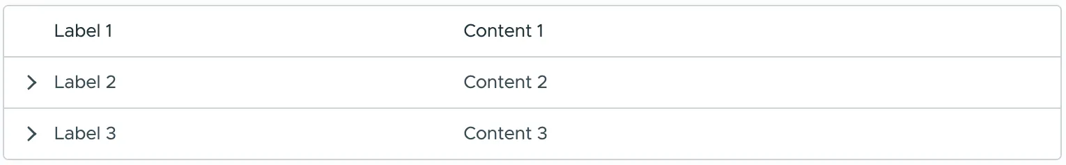
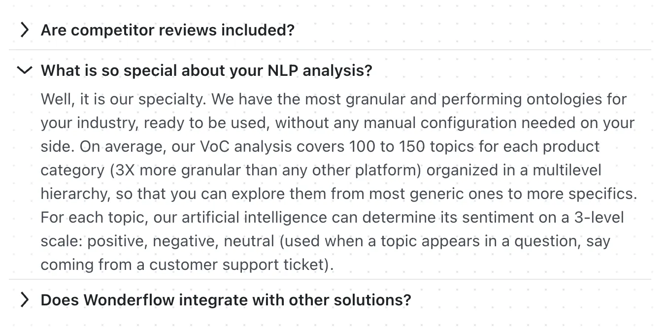
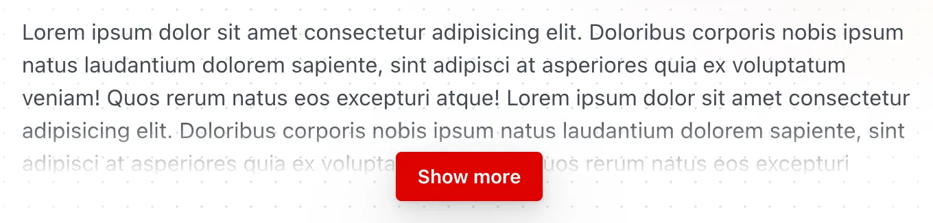
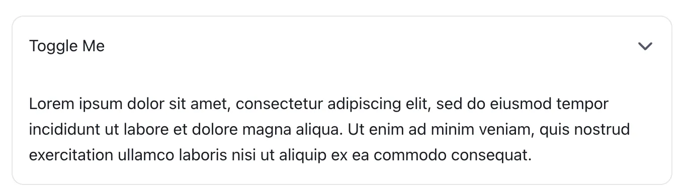
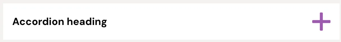
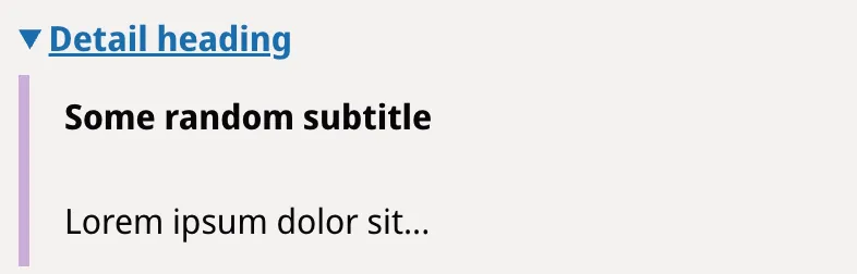
The examples above use a variety of different names: many of these refer to the collapsible/expandable nature of the component, while others reference the HTML element used by their implementation: details. All of these examples have two primary elements in common: a heading and some content: interacting with the heading toggles the visibility of the content; this heading + content pattern can be repeated as many times as needed.
Markup
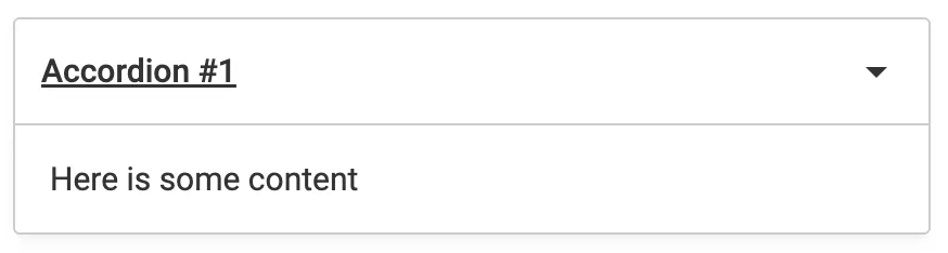
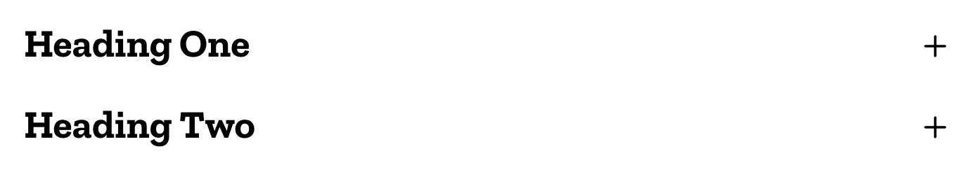
Approach 1: Heading with Button
Here is example markup for a single accordion item:
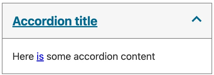
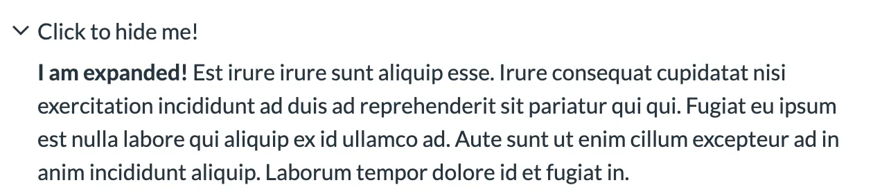
<h2>
  <button
    type="button"
    aria-expanded="false"
    aria-controls="accordion-item-1-content"
  >
    Accordion item 1
    <svg
      xmlns="http://www.w3.org/2000/svg"
      viewBox="0 0 256 256"
      aria-hidden="true"
      focusable="false"
    >
      <polygon points="0,64 128,192 256,64" />
    </svg>
  </button>
</h2>
<div id="accordion-item-1-content">
  <p>Accordion item 1 content</p>
</div>-
This example uses an
h2for the heading but this should be whichever heading level is appropriate for where you’re using it. -
Each accordion item can be in one of two states: expanded or collapsed. This is communicated to assistive technology via the
aria-expandedattribute on the button. -
The
aria-controlsattribute ties the button to the content it controls using theidof the content container (accordion-item-1-contentin the example). -
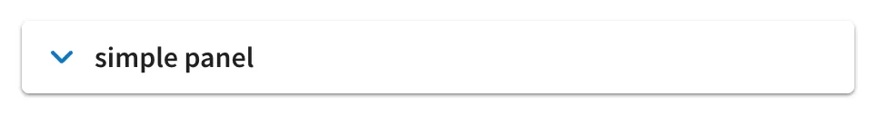
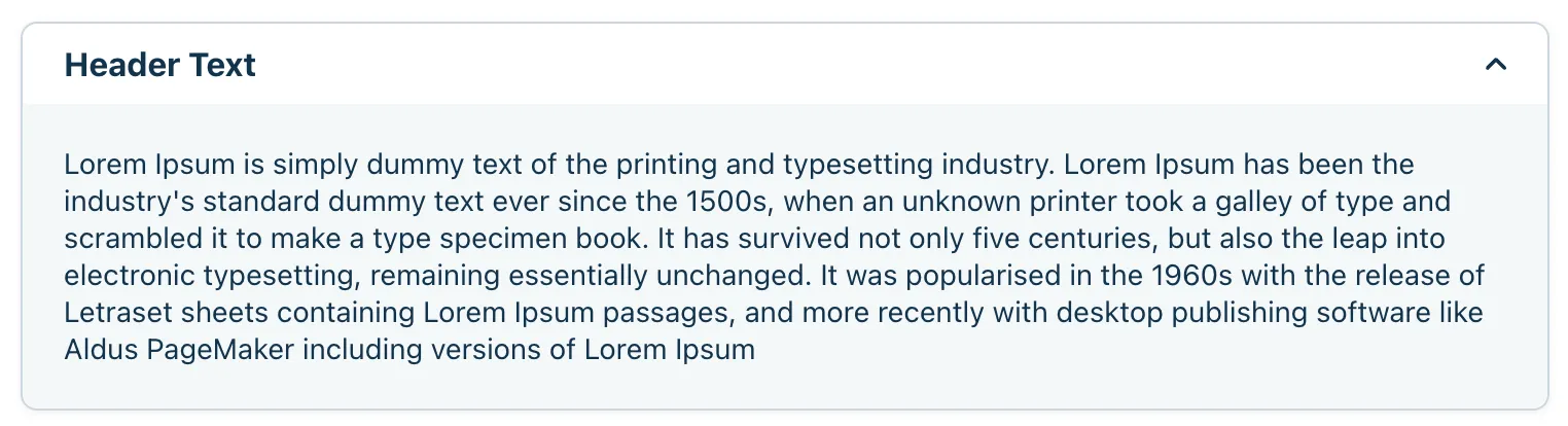
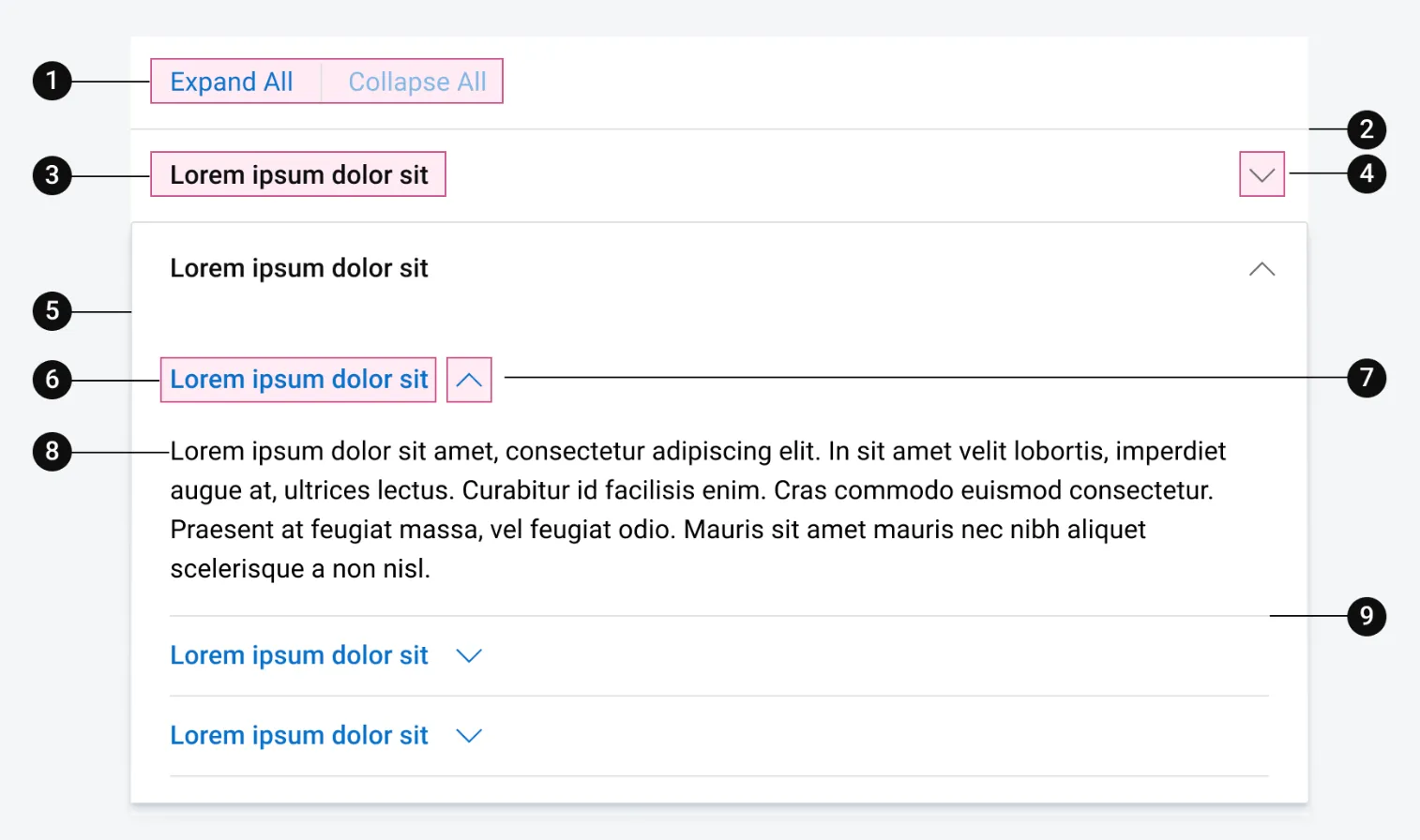
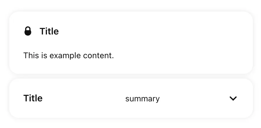
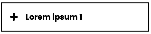
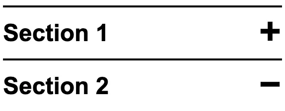
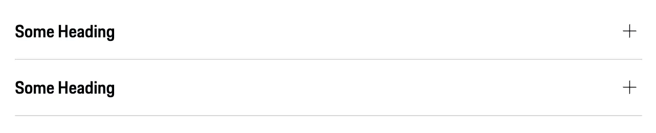
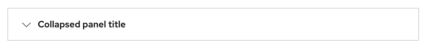
The button contains a downwards-pointing arrow to hint that it can be expanded. When the accordion item is in its expanded state, this is rotated 180 degrees to point upwards. It is also common to see plus (+) and minus (-) symbols used instead of arrows.
-
The icon in this example uses an inline SVG to render the arrow. It is given the
aria-hidden="true"attribute to hide it from assistive technologies (as well asfocusable="false"to address an inconsistency in Internet Explorer and older versions of Edge). You could alternatively use a CSS background image or pseudo-element.
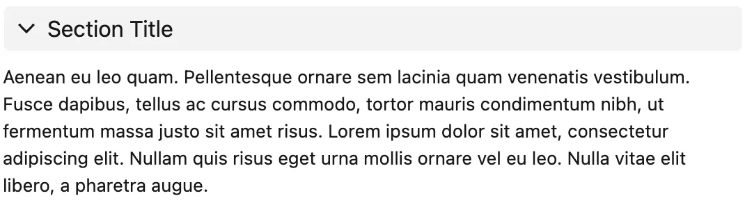
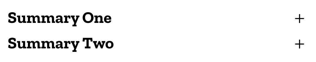
Approach 2: Summary and Details
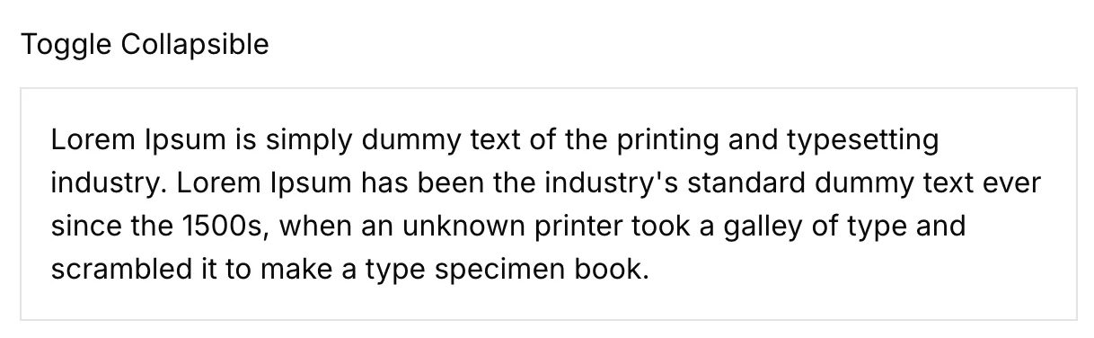
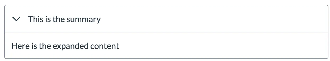
The following example uses the summary and details elements to achieve a similar result to the previous example, without JavaScript:
<details>
  <summary>
    <h2>Accordion item 1</h2>
  </summary>
  <p>Accordion item 1 content</p>
</details>
To set the initial state of the accordion item to be ‘expanded’, you can add the attribute open="true" to the details element (the default is false, so this can be omitted for collapsed items).
Browser support warning: The details and summary elements are not supported by Internet Explorer or Opera Mini at the time of writing.1
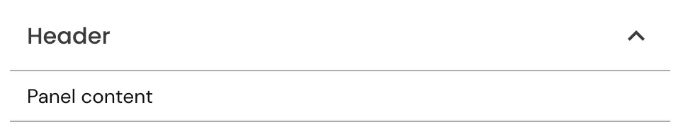
Interactivity
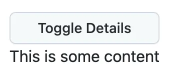
The first example, requires a small amount of JavaScript to toggle the aria-expanded attribute on the button and the visibility of the content.
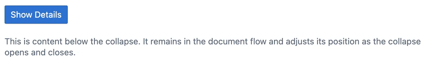
In situations where JavaScript is not enabled or doesn’t work for some reason, it is desirable for the content to still be visible (because the button requires Javascript, the user has no way of making the content visible if JavaScript is disabled). Instead of making the content invisible by default or having buttons that do nothing, you can create your accordion component without the button element, and use JavaScript to progressively enhance the HTML with additional interactivity. There is an example on how to do this on Inclusive Components.
The second example works without JavaScript in browsers that support the details element. In browsers that don’t support the details element, all of the content will be rendered, but it won’t be collapsible.
Styling
If you go for the first approach, using a button element which triggers some JavaScript, you can use the aria-expanded attribute as a hook for styling the button. The following example will rotate the arrow 180 degrees when the accordion is expanded:
button[aria-expanded='true'] > svg {
  transform: rotate(180deg);
}
If you decide on the details and summary elements instead, there are a couple of default browser styles you may want to override:2
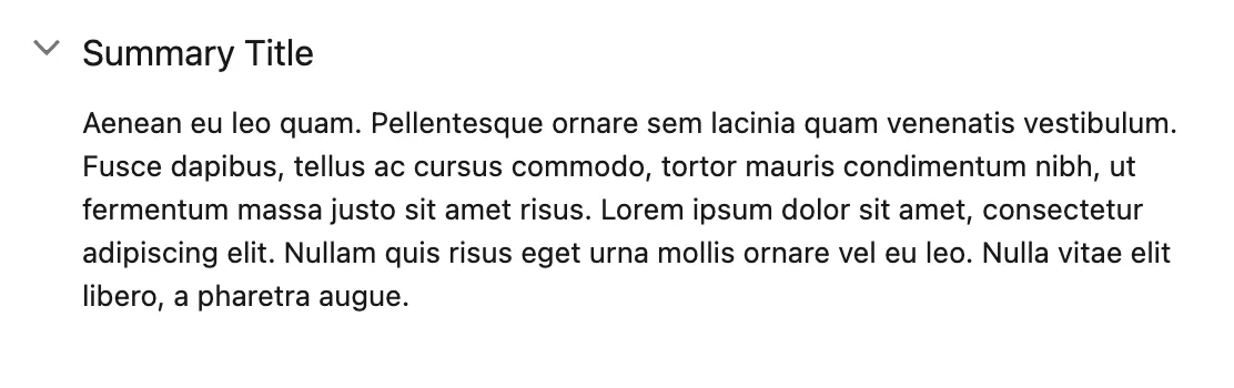
-
The default cursor for the
summaryis the text selection type which doesn’t give great affordance that the element is clickable. The following CSS, will change the cursor to thepointerstyle (like that shown when hovering over links):details summary { cursor: pointer; } -
If you nest a block-level element like a heading in a
summaryelement (as in the example above), it appears below the arrow marker. To make it appear next the the arrow, set itsdisplayproperty toinline:details summary > * { display: inline; }
Usage guidelines
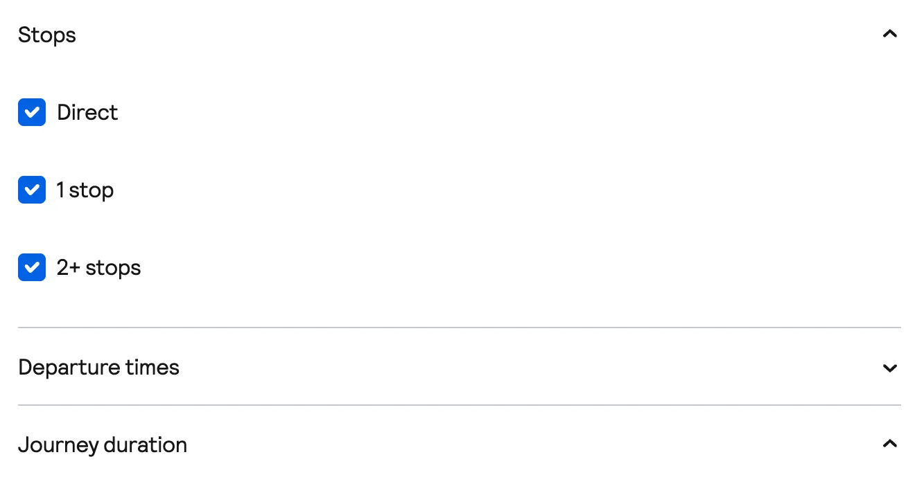
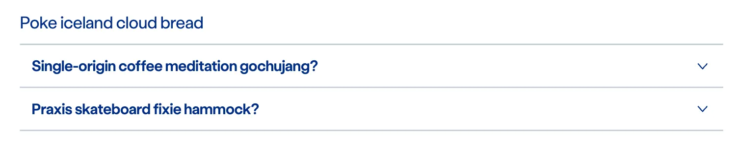
Accordions work well on smaller screens, as they reduce the amount of vertical scrolling required to get an overview of the content. They also require very little horizontal space, unlike components such as tabs.
Some implementations allow for only a single accordion item to be expanded at any one time — do this with caution, as some users may wish to view the content from two items at the same time.
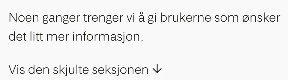
Be mindful that when you are using an accordion you are hiding content from users — they therefore should not be used for essential information.
Footnotes
-
Two Issues Styling the Details Element and How to Solve Them, Greg Gibson on CSS-Tricks ↩
Resources
-
By Page Laubheimer and Raluca Budiu
Nielsen Norman Group
-
By Adrian Roselli
-
By Dave Rupert
-
By Tess Gadd
Balsamiq
-
By Tess Gadd
UX Collective