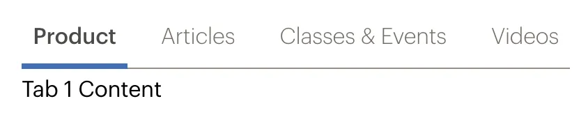
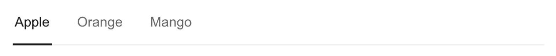
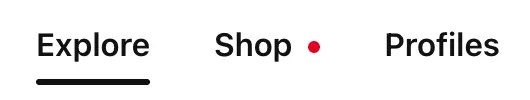
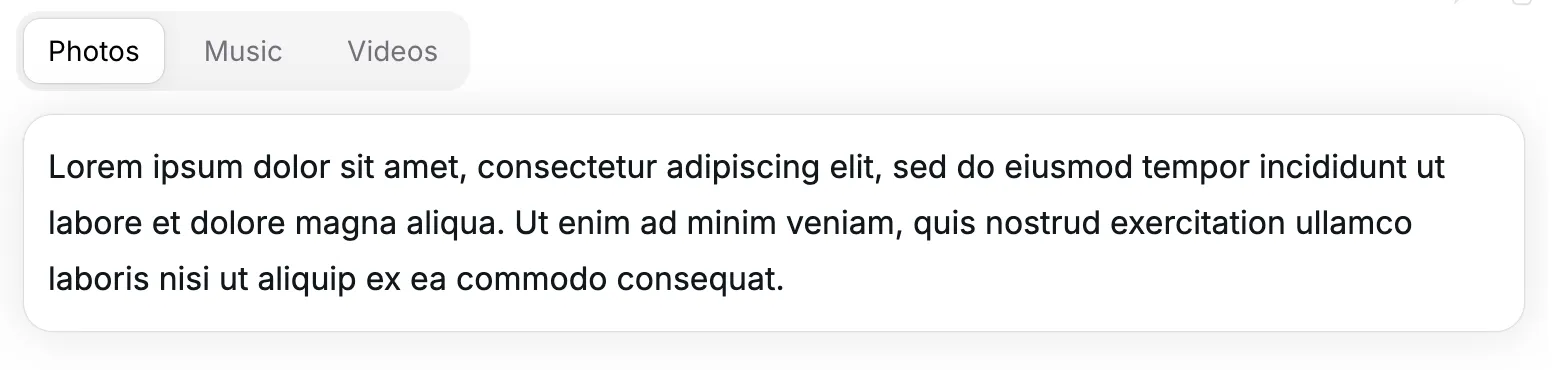
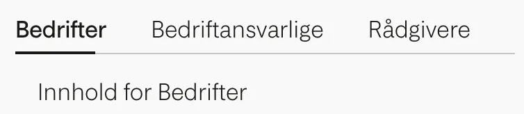
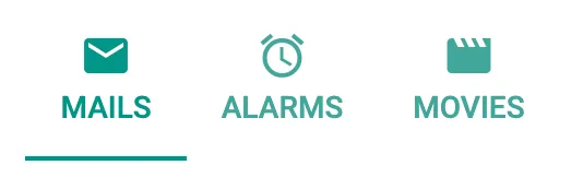
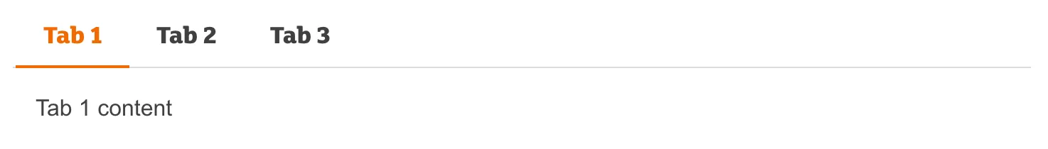
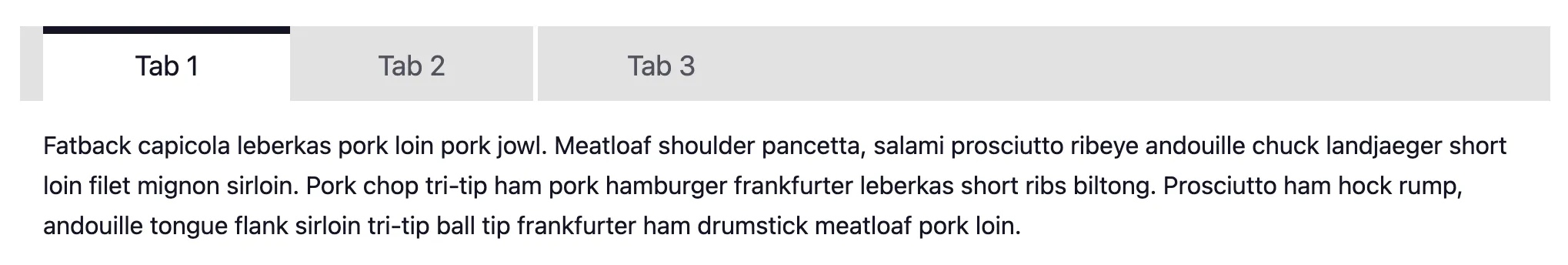
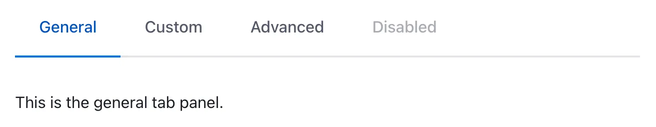
Tabbed interfaces are a way of navigating between multiple panels, reducing clutter and fitting more into a smaller space.
Component
Tabs
Also known as: Tabbed interface
81 Examples (81 shown)
Filter:
-
A11Y Style Guide
Tech
- jQuery
Features
- Code examples
- Usage guidelines
- Accessibility
- Unmaintained
- Open source
-
Ant Design
Tech
- React
Features
- Code examples
- Accessibility issues
- Open source
-
Ariakit
Tech
- React
Features
- Code examples
- Open source
- Accessibility
-
Atlassian Design System
Tech
- React
Features
- Code examples
- Usage guidelines
- Tone of voice
- Accessibility
-
Base Web
Tech
- React
- CSS-in-JS
Features
- Code examples
- Usage guidelines
- Open source
-
Base Web
Tech
- React
- CSS-in-JS
Features
- Code examples
- Usage guidelines
- Open source
-
BBC Global Experience Language
Features
- Accessibility
- Usage guidelines
- Unmaintained
-
Blueprint
Tech
- React
- Sass
Features
- Open source
-
Bolt Design System
Tech
- Sass
- Twig
- Web Components
Features
- Code examples
- Tone of voice
- Open source
-
Bulma
Tech
- Sass
Features
- Code examples
- Accessibility issues
- Open source
-
Carbon Design System
Tech
- React
- Vanilla JS
- Angular
- Vue
- Svelte
- Web Components
Features
- Code examples
- Usage guidelines
- Open source
-
Cauldron
Tech
- React
- CSS
Features
- Code examples
- Usage guidelines
- Accessibility
- Open source
-
Cedar
Tech
- Vue
- Sass
- CSS Modules
Features
- Usage guidelines
- Code examples
- Open source
-
Chakra UI
Tech
- React
- CSS-in-JS
Features
- Code examples
- Open source
-

Clarity Design System
Tech
- CSS
- Angular
- Web Components
Features
- Code examples
- Usage guidelines
- Open source
-
Coral
Tech
- React
Features
- Code examples
- Tone of voice
- Open source
-
Crayons
Tech
- Web Components
Features
- Code examples
- Open source
-
Decathlon Design System
Tech
- CSS
- React
- Svelte
- Vue
- Web Components
Features
- Usage guidelines
- Code examples
- Accessibility
- Open source
-
Dell Design System
Tech
- Vanilla JS
Features
- Code examples
- Usage guidelines
-
Duet Design System
Tech
- Angular
- Vue
- React
Features
- Code examples
-
Duet Design System
Tech
- Angular
- Vue
- React
Features
- Code examples
-
eBay MIND Patterns
Features
- Accessibility
- Usage guidelines
- Open source
-

eBay Playbook
Tech
- HTML
- React
Features
- Code examples
-
Elisa Design System
Tech
- React
Features
- Usage guidelines
- Code examples
- Accessibility
-
Evergreen
Tech
- React
Features
- Open source
-

Flowbite
Tech
- Tailwind CSS
Features
- Open source
- Code examples
-
Fluent UI
Tech
- React
- Web Components
- Mobile
Features
- Usage guidelines
- Code examples
- Accessibility
- Open source
-
Forma 36
Tech
- React
- CSS-in-JS
Features
- Code examples
- Open source
-
Geist Design System
Tech
- React
Features
- Code examples
-
generic-components
Tech
- Web Components
Features
- Code examples
- Accessibility
- Open source
-
Gestalt
Tech
- React
- CSS
Features
- Code examples
- Open source
- Usage guidelines
-
GOV.UK Design System
Tech
- Nunjucks
Features
- Code examples
- Usage guidelines
- Research
- Open source
-
Grommet
Tech
- React
Features
- Code examples
- Open source
-
Headless UI
Tech
- React
- Vue
Features
- Code examples
- Accessibility
- Open source
-
Helios
Tech
- Ember
- Sass
Features
- Code examples
- Usage guidelines
- Accessibility
- Open source
-
Helsinki Design System
Tech
- React
- CSS
Features
- Code examples
- Usage guidelines
- Accessibility
- Open source
-
HeroUI
Tech
- React
- Tailwind CSS
Features
- Code examples
- Open source
-
Inclusive Components
Features
- Code examples
- Accessibility
- Unmaintained
-
Instructure-UI
Tech
- React
- CSS-in-JS
Features
- Code examples
- Accessibility
- Open source
-
Jøkul Designsystem
Tech
- React
- Sass
Features
- Code examples
- Usage guidelines
- Open source
-
Lightning Design System
Tech
- React
Features
- Code examples
- Usage guidelines
- Tone of voice
- Open source
-

Lightning Design System
Tech
- React
Features
- Code examples
- Usage guidelines
- Tone of voice
- Open source
-
Lightning Design System
Tech
- React
Features
- Code examples
- Usage guidelines
- Tone of voice
- Open source
-
Material Design
Tech
- Mobile
- Web Components
- Sass
Features
- Usage guidelines
- Open source
- Accessibility
-

Momentum Design
Tech
- React
- Web Components
Features
- Usage guidelines
- Open source
-
Morningstar Product System
Tech
- Vue
Features
- Usage guidelines
-
Nessie
Tech
- Web Components
- Tailwind CSS
Features
- Usage guidelines
- Code examples
-
NewsKit
Tech
- React
- CSS-in-JS
Features
- Code examples
- Usage guidelines
- Open source
-
Nord Design System
Tech
- Web Components
Features
- Code examples
- Usage guidelines
-
Nucleus Design System
Tech
- Web Components
Features
- Usage guidelines
-
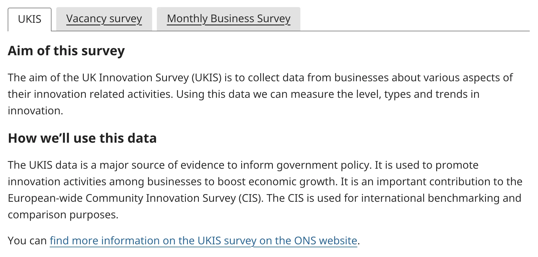
ONS Design System
Tech
- HTML
- Nunjucks
- Sass
Features
- Code examples
- Usage guidelines
- Accessibility
- Open source
-
Orbit
Tech
- React
- CSS-in-JS
Features
- Usage guidelines
- Open source
- Code examples
- Tone of voice
-
Pajamas
Tech
- Vue
Features
- Usage guidelines
- Code examples
- Open source
-
Paste
Tech
- React
- CSS-in-JS
Features
- Usage guidelines
- Code examples
- Tone of voice
- Accessibility
- Open source
-

PatternFly
Tech
- React
- Sass
Features
- Tone of voice
- Open source
- Usage guidelines
-
Pharos
Tech
- Web Components
- Sass
Features
- Usage guidelines
- Open source
- Code examples
- Accessibility
- Tone of voice
-
Polaris
Tech
- React
Features
- Code examples
- Usage guidelines
- Accessibility
- Tone of voice
- Open source
-
Porsche Design System
Tech
- Web Components
- Angular
- React
- Vue
Features
- Code examples
- Open source
-
Porsche Design System
Tech
- Web Components
- Angular
- React
- Vue
Features
- Code examples
- Open source
-
Primer
Tech
- React
Features
- Code examples
- Open source
-

Purple3
Tech
- CSS
Features
- Code examples
- Unmaintained
-
Quasar Framework
Tech
- Vue
Features
- Accessibility issues
- Code examples
- Open source
-
Radix Primitives
Tech
- React
Features
- Code examples
- Open source
-

Reach UI
Tech
- React
Features
- Accessibility
- Code examples
- Open source
-
Red Hat design system
Tech
- Web Components
Features
- Code examples
- Usage guidelines
-
Ruter Components
Tech
- React
Features
- Code examples
- Unmaintained
-
Sainsbury's Design System
Tech
- React
- Sass
Features
- Usage guidelines
- Code examples
- Tone of voice
-
SEB Design Library
Tech
- Sass
- React
- Angular
Features
- Code examples
- Usage guidelines
-
Seeds
Tech
- React
Features
- Code examples
- Usage guidelines
- Tone of voice
-
shadcn/ui
Tech
- React
- Tailwind CSS
Features
- Code examples
- Open source
-
Shoelace
Tech
- Web Components
Features
- Code examples
- Open source
-
Shoelace
Tech
- Web Components
Features
- Code examples
- Open source
-
Shoelace
Tech
- Web Components
Features
- Code examples
- Open source
-
Spectrum
Tech
- CSS
- Web Components
- React
Features
- Code examples
- Usage guidelines
- Tone of voice
- Open source
-
SubZero
Features
- Accessibility issues
-
uStyle
Tech
- Sass
Features
- Tone of voice
- Code examples
- Usage guidelines
- Open source
- Unmaintained
-
Visa Product Design System
Tech
- Angular
- React
- CSS
- Mobile
Features
- Code examples
- Usage guidelines
- Accessibility
- Open source
-
Wanda
Tech
- React
- CSS Modules
Features
- Code examples
- Open source
-
Web Awesome
Tech
- Web Components
Features
- Open source
- Code examples
-
Wise Design
Tech
- Mobile
Features
- Usage guidelines
- Tone of voice
-
Workday Canvas Design System
Tech
- React
Features
- Usage guidelines
- Accessibility
- Tone of voice
- Open source
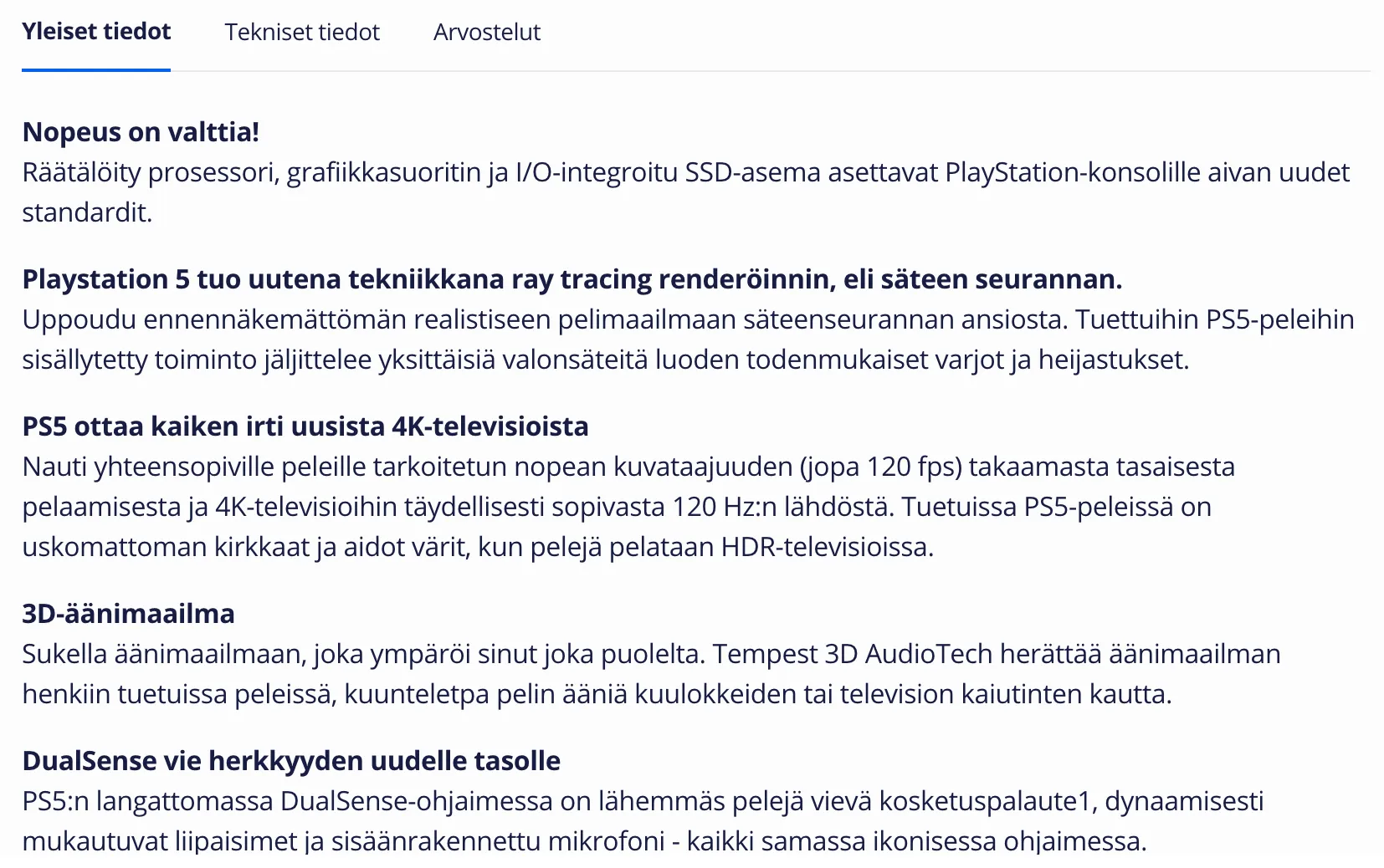
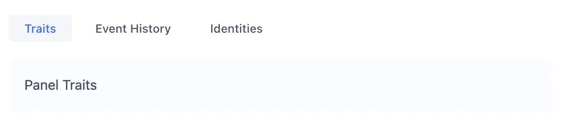
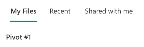
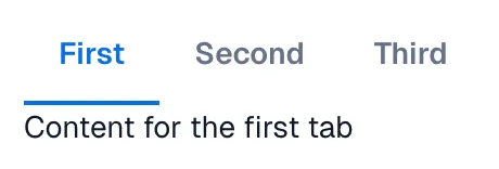
Description
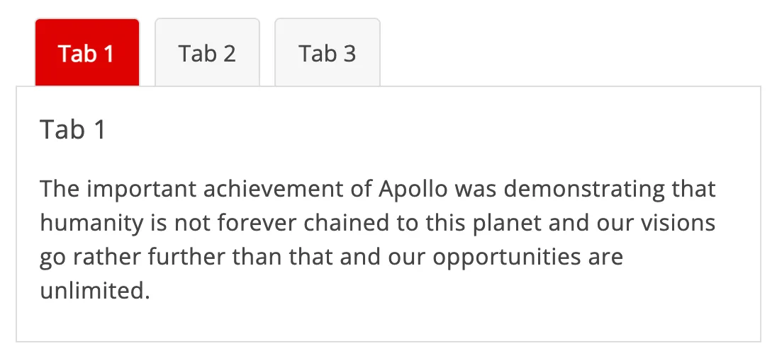
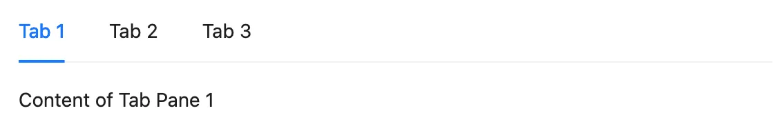
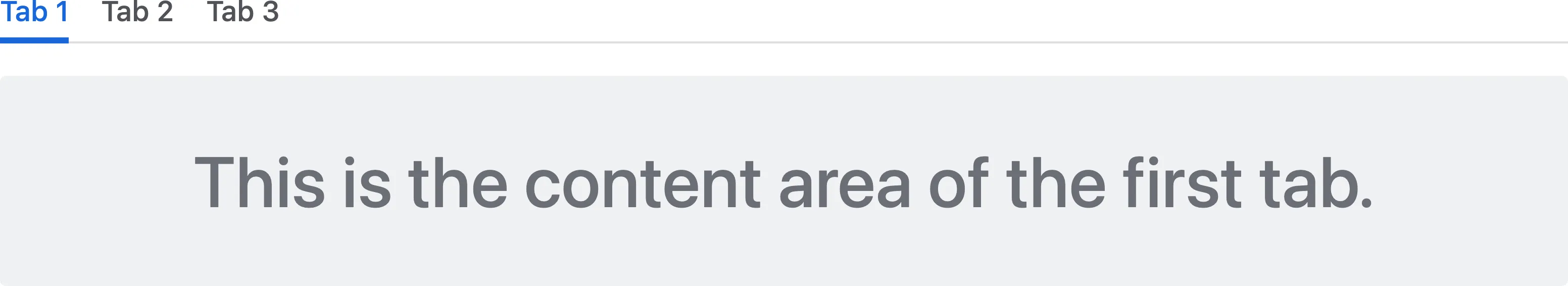
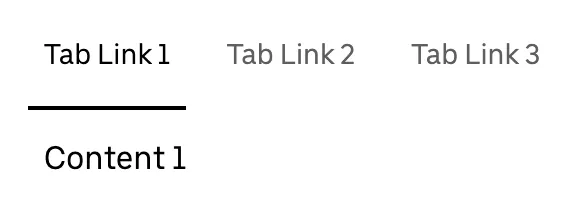
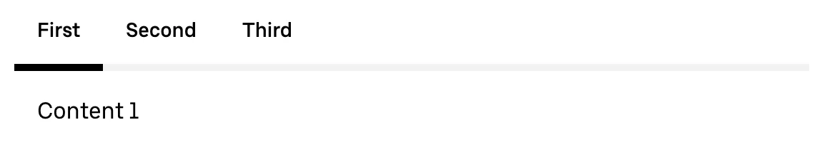
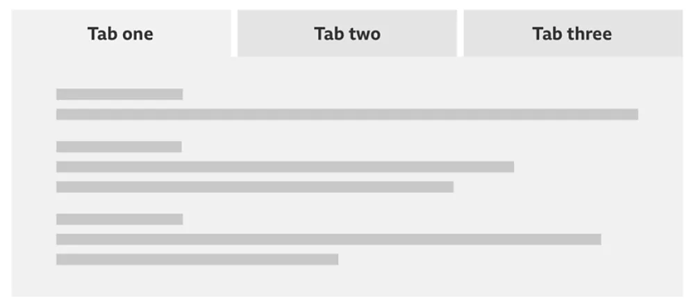
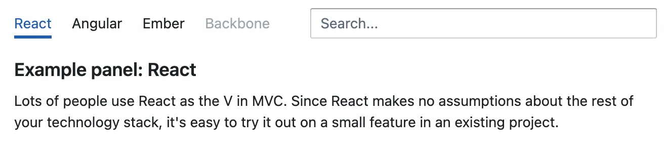
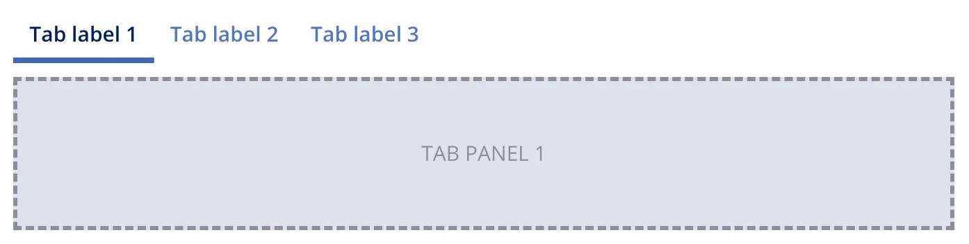
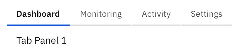
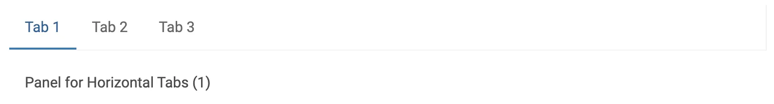
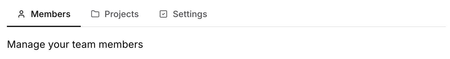
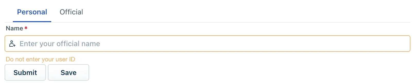
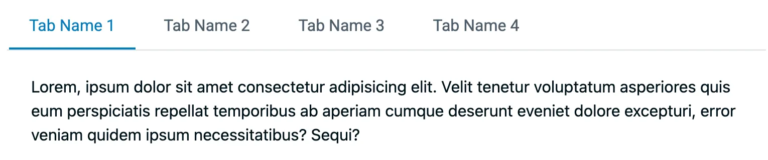
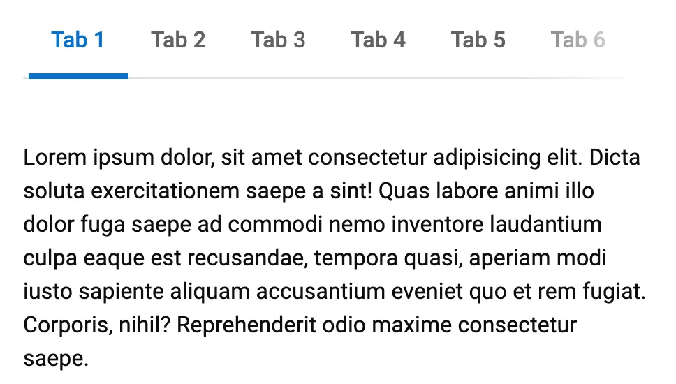
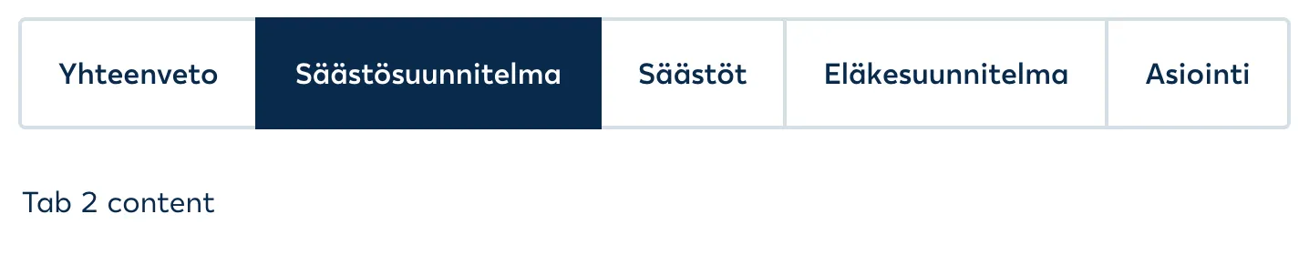
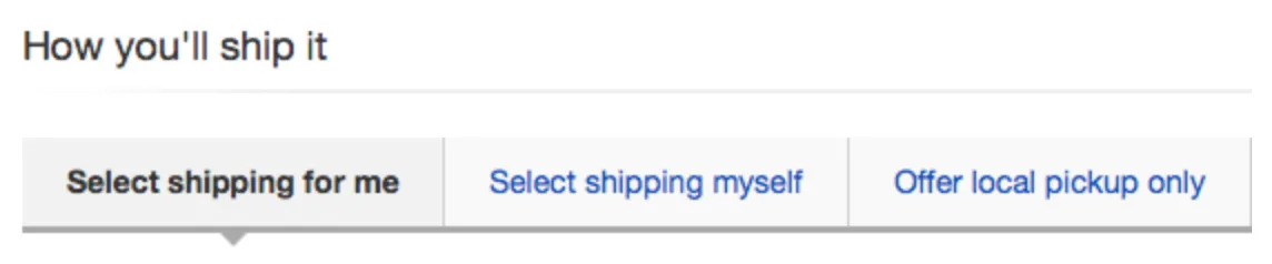
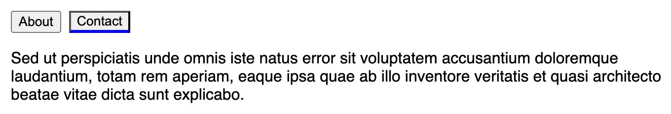
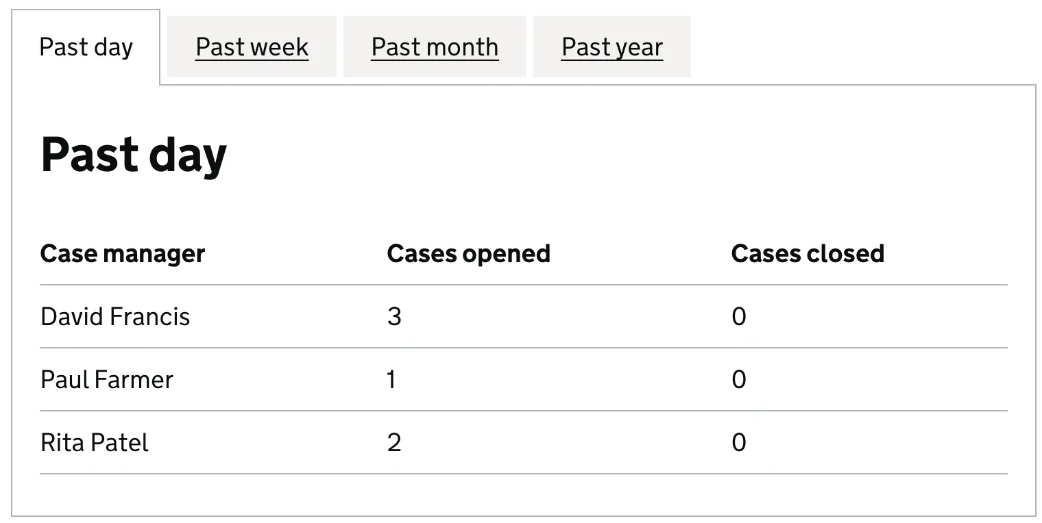
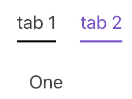
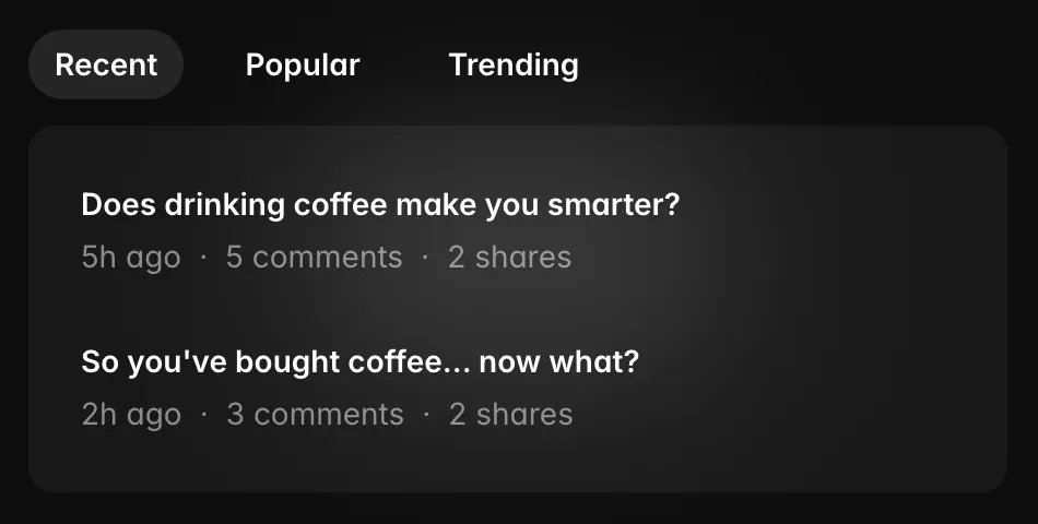
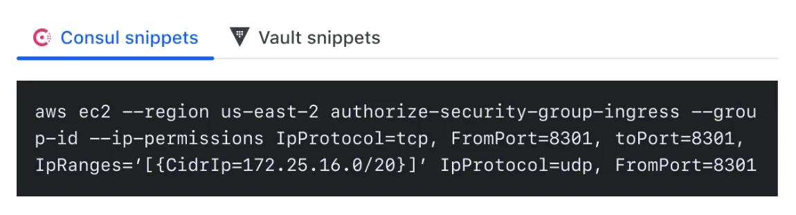
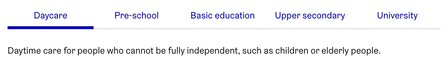
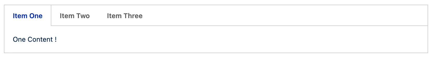
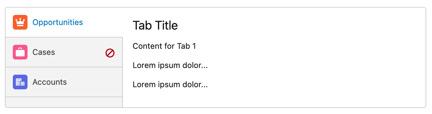
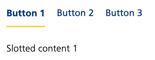
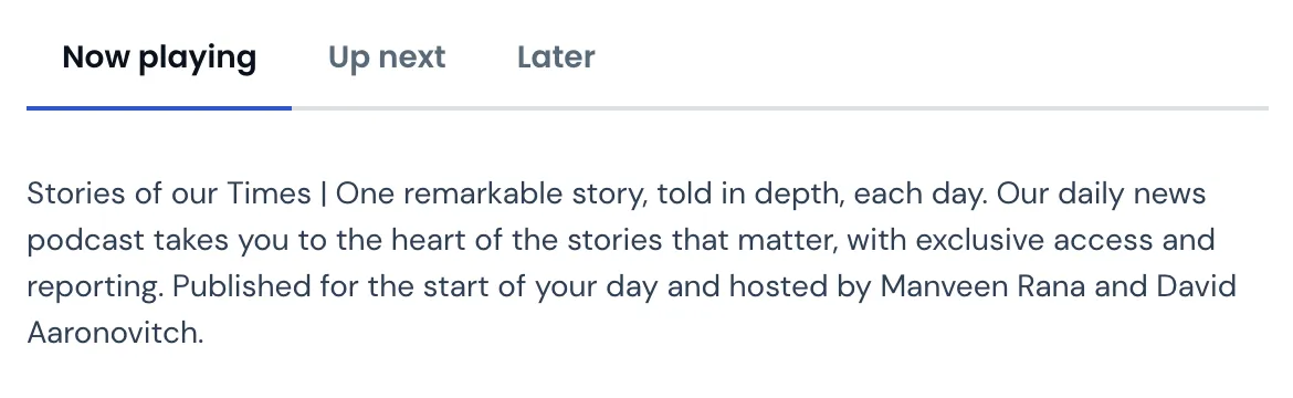
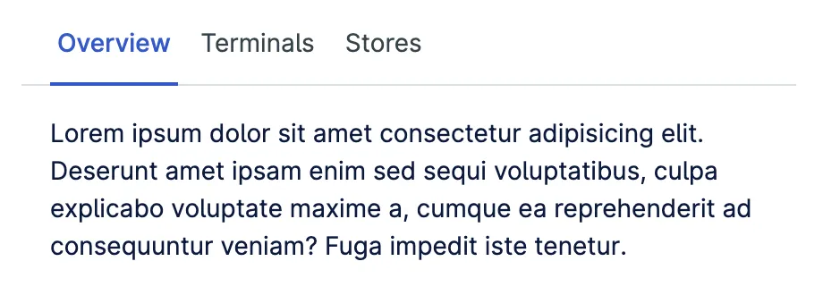
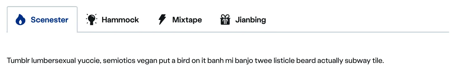
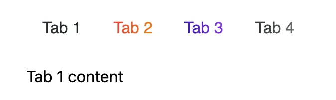
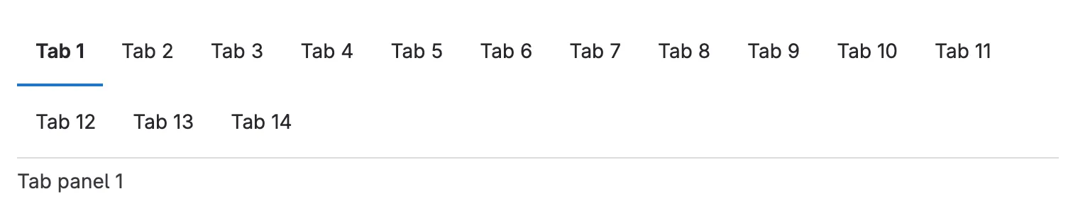
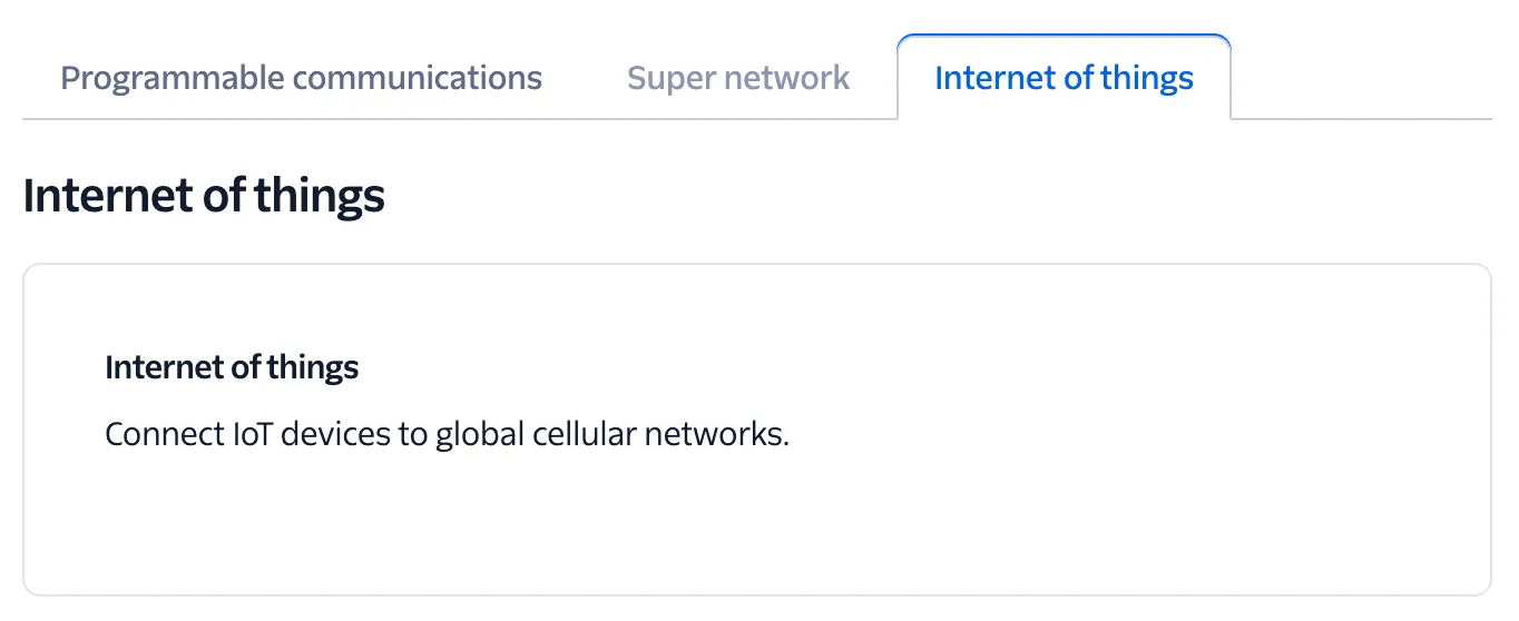
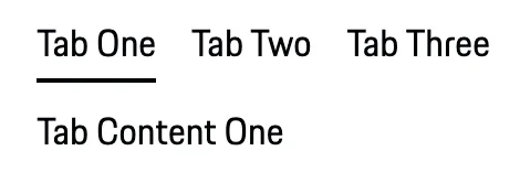
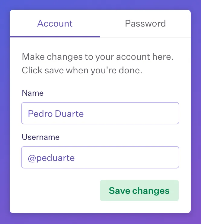
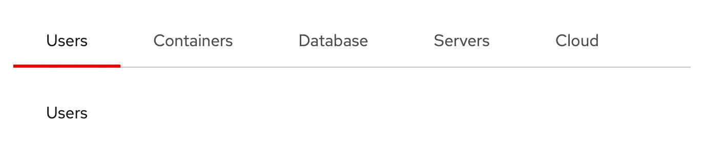
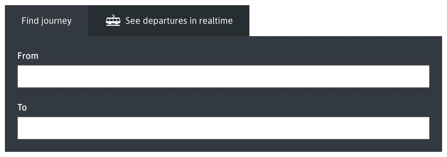
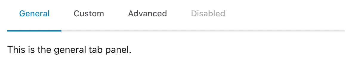
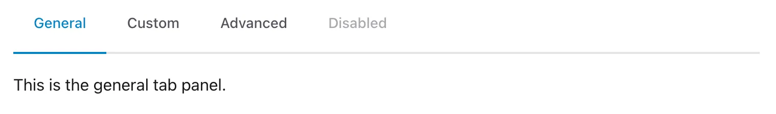
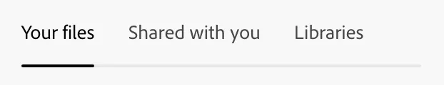
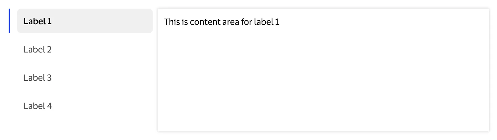
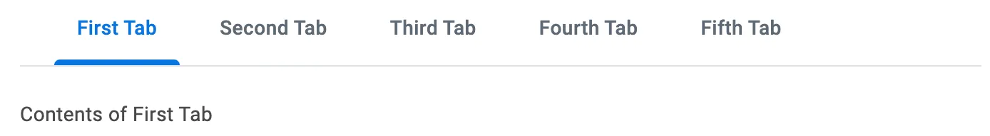
A tabbed interface consists of two key parts:
- the tab list containing the tab elements, along the top or side of…
- the tab panels which contain the content.
Each tab panel has an associated tab in the tab list, that when activated, displays the panel. Only one panel of content is shown at any one time.
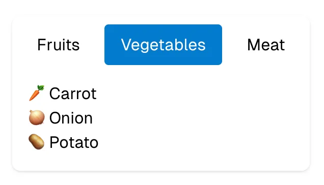
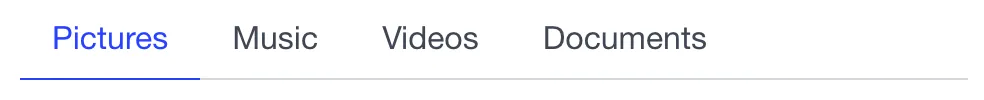
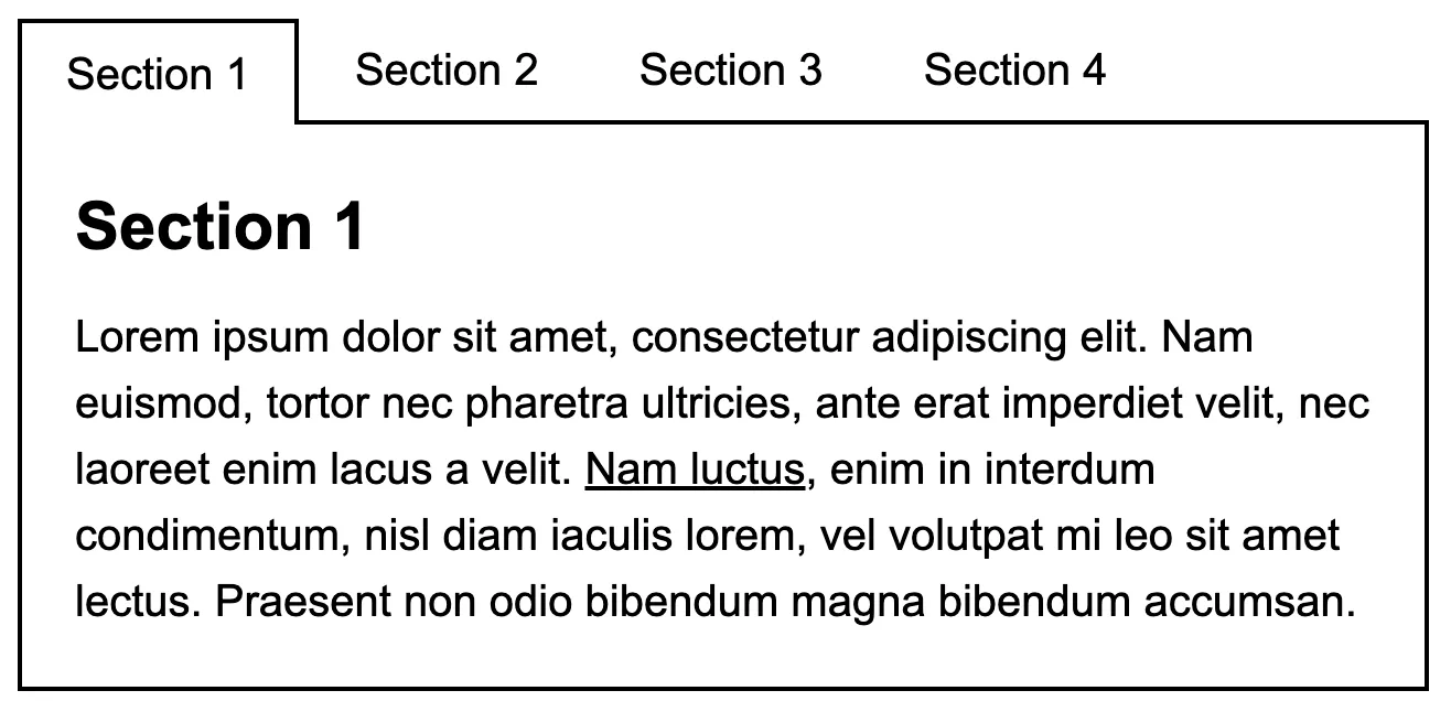
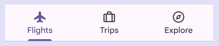
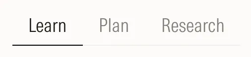
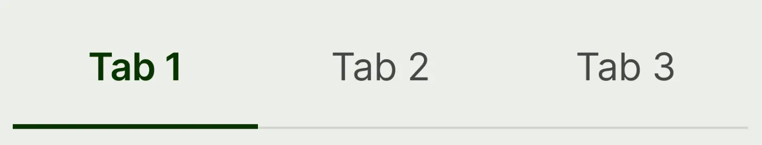
Tabs are an example of an interface metaphor, named after the tabs attached to the top of folders used inside filing cabinets. Each tab is given a label based on the documents inside its corresponding folder. Like their real-world namesake tabbed interfaces allow a user to see the outline of a larger set of data at a glance and quickly navigate to the desired section.
Markup
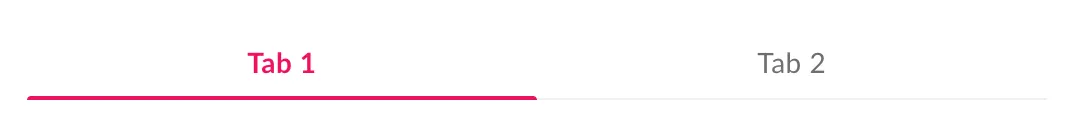
Here is example markup based on the W3C recommended accessible markup for tabs. It describes a set of two tabs, with the first one selected:
<!-- Tabs -->
<div role="tablist" aria-orientation="horizontal">
  <button
    role="tab"
    aria-selected="true"
    id="tab-1"
    aria-controls="tab-panel-1"
  >
    Tab 1
  </button>
  <button
    role="tab"
    aria-selected="false"
    id="tab-2"
    aria-controls="tab-panel-2"
  >
    Tab 2
  </button>
</div>
<!-- Tab panels -->
<div id="tab-panel-1" role="tabpanel" aria-labelledby="tab-1">
  <h2>Tab panel 1 content</h2>
</div>
<div
  id="tab-panel-2"
  role="tabpanel"
  aria-labelledby="tab-2"
  style="display: none;"
>
  <h2>Tab panel 2 content</h2>
</div>
To communicate the semantic meaning and current state of each element to assistive technology, it makes extensive use of aria attributes:
- Use
role="tab"on each tab element androle="tablist"on the tab list. - Give each tab panel
role="tabpanel". - If the tabs are vertically oriented (stacked one on top of the other), give the tab list the attribute
aria-orientation="vertical"(If your tabs are oriented horizontally, you can leave this attribute out as horizontal is the default). - If the tab list has a visible label, link it to the label with
aria-labelledby="{labelId}". Alternatively, the tab list should be labelled using thearia-labelattribute. - Each tab should have the attribute
aria-controls="{tabPanelId}"linking it to the associated tab panel. - The active tab should have
aria-selectedset to true and all other tabs should have it set to false. - Each tab panel should have
aria-labelledby="{tabId}"to link it with its associated tab element.
Styling
When styling your tabs, you can make use of the aria-selected attribute to style the active tab differently. e.g.
.tab[aria-selected='true'] {
  background-color: var(--active-tab-bg-color);
  color: var(--active-tab-text-color);
  font-weight: bold;
}
Ensure each tab also has a visible :focus state.
To show/hide the tab panels you will need to toggle the CSS display property between display: none; and a visible value such as display: block;.
Interactivity
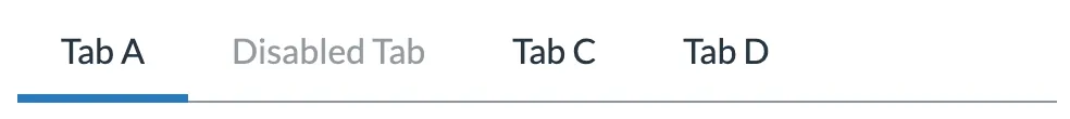
In addition to aria attributes on your HTML elements, to make a tabbed interface keyboard-accessible, you’ll also need to add some custom keybindings1:
- Tab: When tabbing into the tab list, place focus on the active tab element. When focus is on a tab inside the tab list, pressing tab should move focus to the next focusable element in the page outside the tab list.
- Space or Enter should activate the currently focused tab if it wasn’t activated automatically on focus.
- ← and → to cycle between tabs when
aria-orientation="vertical". - ↑ and ↓ to cycle between tabs when
aria-orientation="horizontal".
Caveat: although this is a widely used method for making tabbed interfaces keyboard accessible, some users may not be familiar it; a component that is simpler to interact with (such as an accordion) may be more suited to your specific use case.
Usage guidelines
-
The main benefit of tabs is that they allow a large amount of information to be displayed in a limited space.
-
Be conscious that when you’re using tabs, you’re hiding content. This not only makes it less discoverable for sighted users, but also for users of assistive technology like screen readers.
-
If you’re laying out your tabs horizontally, think about how they will appear at narrower screen widths — will they need to stack vertically or will you be better off swapping out the tabs for a different component (e.g. an accordion)?
Footnotes
Resources
-
Open UI
-
By Tess Gadd
Balsamiq