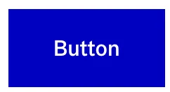
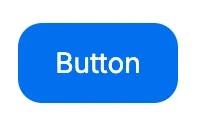
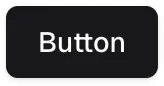
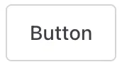
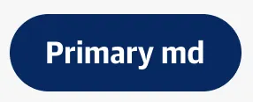
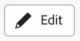
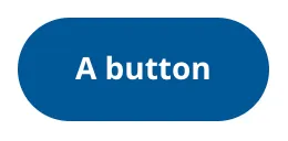
Buttons trigger an action such as submitting a form or showing/hiding an interface component.
Component
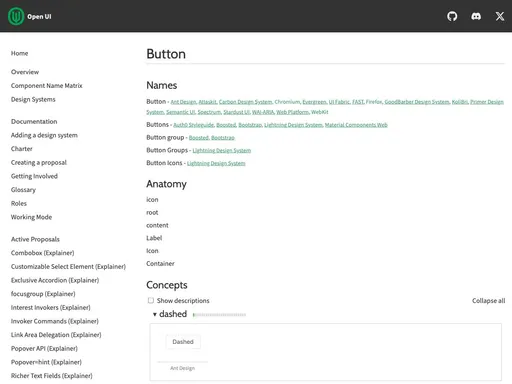
Button
118 Examples (118 shown)
Filter:
-
98.css
Tech
- CSS
Features
- Code examples
- Open source
-
A11Y Style Guide
Tech
- jQuery
Features
- Code examples
- Usage guidelines
- Accessibility
- Unmaintained
- Open source
-
Ant Design
Tech
- React
Features
- Code examples
- Accessibility issues
- Open source
-
Ant Design
Tech
- React
Features
- Code examples
- Accessibility issues
- Open source
-
Ariakit
Tech
- React
Features
- Code examples
- Open source
- Accessibility
-
Atlassian Design System
Tech
- React
Features
- Code examples
- Usage guidelines
- Tone of voice
- Accessibility
-
Auro
Tech
- Web Components
- Sass
Features
- Code examples
- Usage guidelines
- Open source
-
Aurora
Tech
- CSS
Features
- Code examples
- Tone of voice
- Open source
- Unmaintained
-

Backpack
Tech
- Mobile
- React
Features
- Code examples
- Usage guidelines
- Open source
- Tone of voice
-
Backpack
Tech
- Mobile
- React
Features
- Code examples
- Usage guidelines
- Open source
- Tone of voice
-
Backpack
Tech
- Mobile
- React
Features
- Code examples
- Usage guidelines
- Open source
- Tone of voice
-
Base Web
Tech
- React
- CSS-in-JS
Features
- Code examples
- Usage guidelines
- Open source
-
Base Web
Tech
- React
- CSS-in-JS
Features
- Code examples
- Usage guidelines
- Open source
-
Blueprint
Tech
- React
- Sass
Features
- Open source
-
Bootstrap
Tech
- Sass
Features
- Code examples
- Accessibility
- Open source
-
Brighton & Hove City Council Website pattern library
Features
- Unmaintained
-
Bulma
Tech
- Sass
Features
- Code examples
- Accessibility issues
- Open source
-
Carbon Design System
Tech
- React
- Vanilla JS
- Angular
- Vue
- Svelte
- Web Components
Features
- Code examples
- Usage guidelines
- Open source
-
Cauldron
Tech
- React
- CSS
Features
- Code examples
- Usage guidelines
- Accessibility
- Open source
-
Cauldron
Tech
- React
- CSS
Features
- Code examples
- Usage guidelines
- Accessibility
- Open source
-

Cauldron
Tech
- React
- CSS
Features
- Code examples
- Usage guidelines
- Accessibility
- Open source
-
Cauldron
Tech
- React
- CSS
Features
- Code examples
- Usage guidelines
- Accessibility
- Open source
-
Cedar
Tech
- Vue
- Sass
- CSS Modules
Features
- Usage guidelines
- Code examples
- Open source
-
Chakra UI
Tech
- React
- CSS-in-JS
Features
- Code examples
- Open source
-

Chakra UI
Tech
- React
- CSS-in-JS
Features
- Code examples
- Open source
-
Chakra UI
Tech
- React
- CSS-in-JS
Features
- Code examples
- Open source
-
Clarity Design System
Tech
- CSS
- Angular
- Web Components
Features
- Code examples
- Usage guidelines
- Open source
-
Coral
Tech
- React
Features
- Code examples
- Tone of voice
- Open source
-
Coral
Tech
- React
Features
- Code examples
- Tone of voice
- Open source
-

Crayons
Tech
- Web Components
Features
- Code examples
- Open source
-
Decathlon Design System
Tech
- CSS
- React
- Svelte
- Vue
- Web Components
Features
- Usage guidelines
- Code examples
- Accessibility
- Open source
-

Dell Design System
Tech
- Vanilla JS
Features
- Code examples
- Usage guidelines
-
Duet Design System
Tech
- Angular
- Vue
- React
Features
- Code examples
-
eBay MIND Patterns
Features
- Accessibility
- Usage guidelines
- Open source
-
eBay Playbook
Tech
- HTML
- React
Features
- Code examples
-
Elastic UI framework
Tech
- React
- CSS-in-JS
Features
- Code examples
- Open source
-
Elisa Design System
Tech
- React
Features
- Usage guidelines
- Code examples
- Accessibility
-
Flowbite
Tech
- Tailwind CSS
Features
- Open source
- Code examples
-
Fluent UI
Tech
- React
- Web Components
- Mobile
Features
- Usage guidelines
- Code examples
- Accessibility
- Open source
-
Forma 36
Tech
- React
- CSS-in-JS
Features
- Code examples
- Open source
-

Forma 36
Tech
- React
- CSS-in-JS
Features
- Code examples
- Open source
-

Forma 36
Tech
- React
- CSS-in-JS
Features
- Code examples
- Open source
-

Geist Design System
Tech
- React
Features
- Code examples
-
Gestalt
Tech
- React
- CSS
Features
- Code examples
- Open source
- Usage guidelines
-
Gestalt
Tech
- React
- CSS
Features
- Code examples
- Open source
- Usage guidelines
-

Gestalt
Tech
- React
- CSS
Features
- Code examples
- Open source
- Usage guidelines
-
Gestalt
Tech
- React
- CSS
Features
- Code examples
- Open source
- Usage guidelines
-
giffgaff design system
Features
- Usage guidelines
- Code examples
-
GOLD Design System
Tech
- React
- Sass
Features
- Code examples
- Usage guidelines
- Accessibility
- Open source
- Unmaintained
-
GOV.UK Design System
Tech
- Nunjucks
Features
- Code examples
- Usage guidelines
- Research
- Open source
-
Grommet
Tech
- React
Features
- Code examples
- Open source
-
Headless UI
Tech
- React
- Vue
Features
- Code examples
- Accessibility
- Open source
-
Helios
Tech
- Ember
- Sass
Features
- Code examples
- Usage guidelines
- Accessibility
- Open source
-
Helsinki Design System
Tech
- React
- CSS
Features
- Code examples
- Usage guidelines
- Accessibility
- Open source
-
HeroUI
Tech
- React
- Tailwind CSS
Features
- Code examples
- Open source
-
Instructure-UI
Tech
- React
- CSS-in-JS
Features
- Code examples
- Accessibility
- Open source
-

Instructure-UI
Tech
- React
- CSS-in-JS
Features
- Code examples
- Accessibility
- Open source
-

Instructure-UI
Tech
- React
- CSS-in-JS
Features
- Code examples
- Accessibility
- Open source
-
Instructure-UI
Tech
- React
- CSS-in-JS
Features
- Code examples
- Accessibility
- Open source
-

Instructure-UI
Tech
- React
- CSS-in-JS
Features
- Code examples
- Accessibility
- Open source
-
Jøkul Designsystem
Tech
- React
- Sass
Features
- Code examples
- Usage guidelines
- Open source
-
Jøkul Designsystem
Tech
- React
- Sass
Features
- Code examples
- Usage guidelines
- Open source
-
Lightning Design System
Tech
- React
Features
- Code examples
- Usage guidelines
- Tone of voice
- Open source
-
Material Design
Tech
- Mobile
- Web Components
- Sass
Features
- Usage guidelines
- Open source
- Accessibility
-
Morningstar Product System
Tech
- Vue
Features
- Usage guidelines
-

Mozilla Protocol
Tech
- Handlebars
- Sass
Features
- Usage guidelines
- Open source
-
Mozilla Protocol
Tech
- Handlebars
- Sass
Features
- Usage guidelines
- Open source
-
Nessie
Tech
- Web Components
- Tailwind CSS
Features
- Usage guidelines
- Code examples
-
NewsKit
Tech
- React
- CSS-in-JS
Features
- Code examples
- Usage guidelines
- Open source
-
NHS Digital service manual
Tech
- Nunjucks
Features
- Code examples
- Usage guidelines
- Research
- Tone of voice
- Open source
-
No Style Design System
Tech
- Sass
- jQuery
Features
- Open source
- Unmaintained
-
Nord Design System
Tech
- Web Components
Features
- Code examples
- Usage guidelines
-
ONS Design System
Tech
- HTML
- Nunjucks
- Sass
Features
- Code examples
- Usage guidelines
- Accessibility
- Open source
-
Ontario Design System
Tech
- HTML
- Sass
Features
- Code examples
- Usage guidelines
- Accessibility
-
Orbit
Tech
- React
- CSS-in-JS
Features
- Usage guidelines
- Open source
- Code examples
- Tone of voice
-
Orbit
Tech
- React
- CSS-in-JS
Features
- Usage guidelines
- Open source
- Code examples
- Tone of voice
-
Pajamas
Tech
- Vue
Features
- Usage guidelines
- Code examples
- Open source
-
Paste
Tech
- React
- CSS-in-JS
Features
- Usage guidelines
- Code examples
- Tone of voice
- Accessibility
- Open source
-
PatternFly
Tech
- React
- Sass
Features
- Tone of voice
- Open source
- Usage guidelines
-
Pharos
Tech
- Web Components
- Sass
Features
- Usage guidelines
- Open source
- Code examples
- Accessibility
- Tone of voice
-
Polaris
Tech
- React
Features
- Code examples
- Usage guidelines
- Accessibility
- Tone of voice
- Open source
-
Porsche Design System
Tech
- Web Components
- Angular
- React
- Vue
Features
- Code examples
- Open source
-
Porsche Design System
Tech
- Web Components
- Angular
- React
- Vue
Features
- Code examples
- Open source
-
Porsche Design System
Tech
- Web Components
- Angular
- React
- Vue
Features
- Code examples
- Open source
-
Primer
Tech
- React
Features
- Code examples
- Open source
-

Primer
Tech
- React
Features
- Code examples
- Open source
-
Purple3
Tech
- CSS
Features
- Code examples
- Unmaintained
-
Quasar Framework
Tech
- Vue
Features
- Accessibility issues
- Code examples
- Open source
-
Quasar Framework
Tech
- Vue
Features
- Accessibility issues
- Code examples
- Open source
-
Red Hat design system
Tech
- Web Components
Features
- Code examples
- Usage guidelines
-
Ruter Components
Tech
- React
Features
- Code examples
- Unmaintained
-

Sainsbury's Design System
Tech
- React
- Sass
Features
- Usage guidelines
- Code examples
- Tone of voice
-
SEB Design Library
Tech
- Sass
- React
- Angular
Features
- Code examples
- Usage guidelines
-
Seeds
Tech
- React
Features
- Code examples
- Usage guidelines
- Tone of voice
-
Seek style guide
Tech
- React
Features
- Code examples
- Unmaintained
-
shadcn/ui
Tech
- React
- Tailwind CSS
Features
- Code examples
- Open source
-

shadcn/ui
Tech
- React
- Tailwind CSS
Features
- Code examples
- Open source
-
Shoelace
Tech
- Web Components
Features
- Code examples
- Open source
-

Shoelace
Tech
- Web Components
Features
- Code examples
- Open source
-
Source
Tech
- React
Features
- Code examples
- Usage guidelines
- Open source
-
Spectrum
Tech
- CSS
- Web Components
- React
Features
- Code examples
- Usage guidelines
- Tone of voice
- Open source
-
Spectrum
Tech
- CSS
- Web Components
- React
Features
- Code examples
- Usage guidelines
- Tone of voice
- Open source
-
Stacks
Tech
- Stimulus
Features
- Code examples
- Usage guidelines
- Tone of voice
- Open source
-
SubZero
Features
- Accessibility issues
-
SubZero
Features
- Accessibility issues
-
Thumbprint
Tech
- React
- Sass
Features
- Code examples
- Open source
-
United States Web Design System
Tech
- Nunjucks
Features
- Code examples
- Usage guidelines
- Open source
-
uStyle
Tech
- Sass
Features
- Tone of voice
- Code examples
- Usage guidelines
- Open source
- Unmaintained
-
Visa Product Design System
Tech
- Angular
- React
- CSS
- Mobile
Features
- Code examples
- Usage guidelines
- Accessibility
- Open source
-
W3C design system
Tech
- Sass
- Vanilla JS
Features
- Code examples
- Usage guidelines
- Open source
- Accessibility
-
Wanda
Tech
- React
- CSS Modules
Features
- Code examples
- Open source
-

Wanda
Tech
- React
- CSS Modules
Features
- Code examples
- Open source
-
Wanda
Tech
- React
- CSS Modules
Features
- Code examples
- Open source
-
Web Awesome
Tech
- Web Components
Features
- Open source
- Code examples
-
West Midlands Network Design System
Tech
- HTML
- Nunjucks
- Sass
Features
- Code examples
- Usage guidelines
- Open source
-
Wise Design
Tech
- Mobile
Features
- Usage guidelines
- Tone of voice
-
Wise Design
Tech
- Mobile
Features
- Usage guidelines
- Tone of voice
-
Workday Canvas Design System
Tech
- React
Features
- Usage guidelines
- Accessibility
- Tone of voice
- Open source
Description
It’s important to make a distinction here: when people talk about buttons on the web, they’re probably talking about one of three things:
- A
<button>element which, depending on its type attribute (submit,resetorbutton), triggers some kind of action: submitting a form, clearing a form, or triggering a JavaScript function. - An
<input>element with one of the three types:submit,resetorbutton. These are functionally almost identical to a<button>element with the same type attribute. - Any other HTML element that looks like a button, but isn’t a
<button>element. This category includes ‘call-to-action’ links designed to look like buttons and other elements (e.g. a<div>) with JavaScriptonclickevents.
In most cases, it’s preferable to use a <button> instead of the corresponding <input>: With a <button> the label text goes between opening and closing tags, allowing you to include other HTML elements inside the label; with <input> you’re restricted to using the value attribute which only has support for text strings.
If you’re interested in the third category, you’re probably either looking for the page on links or you’re using the wrong element for your buttons (and you should read on to learn why).
Markup
Here is an example button:
<button type="button">I'm a button, click me</button>The most important thing to note is the type attribute; this can be one of the following:
submit: The button submits the form data to the server.reset: The button resets all the controls to their initial values.button: The button has no default behaviour and does nothing when pressed; it needs a JavaScript event listener attached to it to do anything.
Buttons of type submit and reset will do nothing if not placed within a form. If there is no type attribute specified, or the type is invalid, the button is treated as if it had type="submit".
As you can probably see, there’s not much markup required here at all, so it’s surprising how often mistakes are made. Here is one commonly used (anti)pattern:
<a href="#">I'm a button, click me</a>By default, this link does nothing but append a ’#’ to the current URL. If you attach a JavaScript event listener to the element, you can prevent the default behaviour and trigger an action (this example uses jQuery):
$('a').click(function (e) {
  e.preventDefault();
  /* your_code_here; */
  return false;
});
While this technically achieves its purpose (and is the top answer to this stack overflow question viewed 1.3million times) it’s still a hack. Users expect certain behaviours from links (e.g. middle click to open in new tab) and others from a button (e.g. ‘click’ with the space key). When those expectations are not met, this can lead to confusion and frustration.
A far worse thing to do would be to use a non-focusable element such as a <span>, <div> or an <a> with a missing href attribute. These will not appear in the tab order and are therefore inaccessible to those users who navigate solely using a keyboard.
<!-- Neither of these “buttons” are buttons to assistive technologies -->
<div class="button">I'm a button, click me</div>
<span class="button">I'm a button, click me</span>

<!-- A button with no href is not focusable -->
<a class="button">I'm a button, click me</a>
It’s worth noting that although it is possible to make these non-focusable elements accessible, this is only possible by fully replicating the functionality of the native
<button>element. This involves using attributes such astabindex="0"(to make the element focusable); ARIA to communicate semantics to assistive technology; and JavaScript event listeners to add keyboard, touch and mouse interactivity. This is a lot of extra work considering the native button element gives you all this behaviour for free.
In Summary:
- Use buttons to perform an action. e.g. ‘Submit’, ‘Delete’, ‘Create’, ‘Hide’
- Give your buttons a
typeattribute - Make buttons look like buttons (and links look like links)123
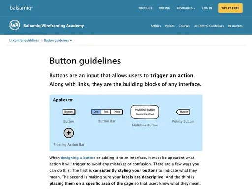
Styling
As well as using the correct element, it’s important to make your buttons look and behave like the correct element. As already mentioned, users have certain expectations around how to interact with an element based on its appearance (known as affordances). Here are some techniques you can use to make buttons more obvious to users:4
- Dynamically size the button to fit the text in it
- Keep the text centre-aligned on a single line
- Ensure the button has distinct styles for disabled, hover, focused, active/pressed and default states.
- Unless it appears inside a button group with other options, use whitespace around the button to distance it from other content.
- Make the button big enough so users of touch devices can comfortably use it (a minimum of 10mm in both dimensions)
If it fits within the design of your website, you could also try:
- Give your buttons rounded corners
- Use subtle box-shadows to raise the button above the rest of the page
- Add a gradient background to give it a 3D appearance
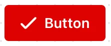
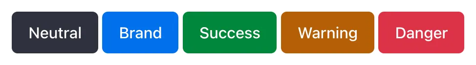
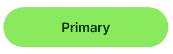
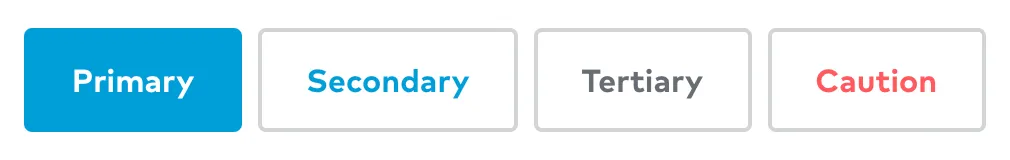
If using multiple buttons that you want to give different prominence, style each one differently: primary actions should be visually more important-looking than secondary actions. Buttons that trigger a potentially negative action such as deleting something can be differentiated with use of the colour red. Consider including a hierarchy of different button styles based on importance.
A note on cursor: pointer
Don’t use the CSS property cursor: pointer to change the default cursor when hovering over a button — cursor: pointer is for links. Your buttons should be designed so a user can tell that they are clickable without a different cursor5.
Usage guidelines
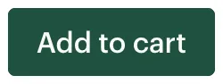
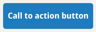
Communicate the purpose of a button clearly and concisely using a text label, an icon, or both. Instead of using generic labels like ‘OK’ or ‘Cancel’, think about what action clicking the button will trigger — if it deletes something, use ‘Delete’; if it places an order, use ‘Place order’.
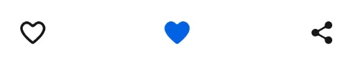
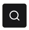
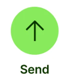
If using only an icon, you will need to ensure the button has a meaningful label6. This label can be included inside the button and hidden visually using a screenreader-only CSS class. Alternatively, the label can be linked to the button using the aria attributes aria-label or aria-labelledby. Keep in mind that even if you find the meaning of an icon obvious, your users may not.
Footnotes
Related components
-
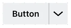
Toolbar
A wrapper for multiple, related buttons.
Resources
-
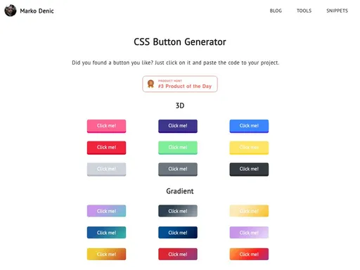
By Marko Denic
-
By Heydon Pickering
-
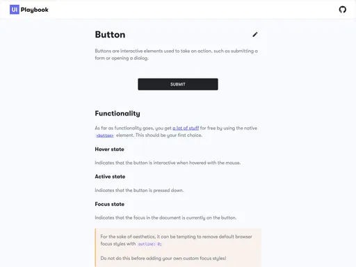
UI Playbook
-
Open UI
-
-
By Nick Babich
Smashing Magazine
-
Uiverse.io
-
By Vadim Makeev
Smashing Magazine
-
By Tess Gadd
Balsamiq