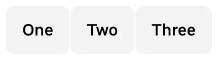
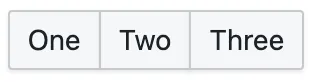
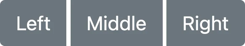
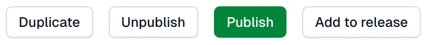
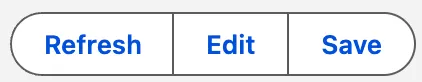
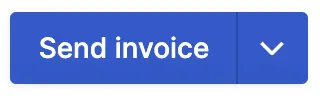
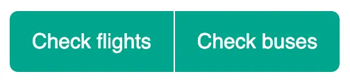
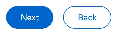
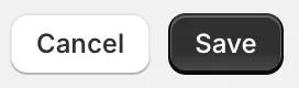
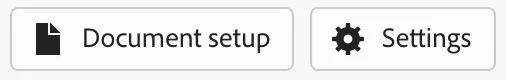
A wrapper for multiple, related buttons.
Component
Button group
Also known as: Toolbar
36 Examples (36 shown)
Filter:
-
Base Web
Tech
- React
- CSS-in-JS
Features
- Code examples
- Usage guidelines
- Open source
-
Base Web
Tech
- React
- CSS-in-JS
Features
- Code examples
- Usage guidelines
- Open source
-
Blueprint
Tech
- React
- Sass
Features
- Open source
-
Bootstrap
Tech
- Sass
Features
- Code examples
- Accessibility
- Open source
-

Clarity Design System
Tech
- CSS
- Angular
- Web Components
Features
- Code examples
- Usage guidelines
- Open source
-
Coral
Tech
- React
Features
- Code examples
- Tone of voice
- Open source
-

Crayons
Tech
- Web Components
Features
- Code examples
- Open source
-
Elastic UI framework
Tech
- React
- CSS-in-JS
Features
- Code examples
- Open source
-
Elisa Design System
Tech
- React
Features
- Usage guidelines
- Code examples
- Accessibility
-
Flowbite
Tech
- Tailwind CSS
Features
- Open source
- Code examples
-

Fluent UI
Tech
- React
- Web Components
- Mobile
Features
- Usage guidelines
- Code examples
- Accessibility
- Open source
-
Forma 36
Tech
- React
- CSS-in-JS
Features
- Code examples
- Open source
-

Gestalt
Tech
- React
- CSS
Features
- Code examples
- Open source
- Usage guidelines
-
Helios
Tech
- Ember
- Sass
Features
- Code examples
- Usage guidelines
- Accessibility
- Open source
-
Lightning Design System
Tech
- React
Features
- Code examples
- Usage guidelines
- Tone of voice
- Open source
-
Mozilla Protocol
Tech
- Handlebars
- Sass
Features
- Usage guidelines
- Open source
-

Nessie
Tech
- Web Components
- Tailwind CSS
Features
- Usage guidelines
- Code examples
-
Nord Design System
Tech
- Web Components
Features
- Code examples
- Usage guidelines
-
Orbit
Tech
- React
- CSS-in-JS
Features
- Usage guidelines
- Open source
- Code examples
- Tone of voice
-
PatternFly
Tech
- React
- Sass
Features
- Tone of voice
- Open source
- Usage guidelines
-
Polaris
Tech
- React
Features
- Code examples
- Usage guidelines
- Accessibility
- Tone of voice
- Open source
-
Polaris
Tech
- React
Features
- Code examples
- Usage guidelines
- Accessibility
- Tone of voice
- Open source
-
Porsche Design System
Tech
- Web Components
- Angular
- React
- Vue
Features
- Code examples
- Open source
-
Primer
Tech
- React
Features
- Code examples
- Open source
-
Primer
Tech
- React
Features
- Code examples
- Open source
-
Quasar Framework
Tech
- Vue
Features
- Accessibility issues
- Code examples
- Open source
-

Ruter Components
Tech
- React
Features
- Code examples
- Unmaintained
-
Seek style guide
Tech
- React
Features
- Code examples
- Unmaintained
-
shadcn/ui
Tech
- React
- Tailwind CSS
Features
- Code examples
- Open source
-
Shoelace
Tech
- Web Components
Features
- Code examples
- Open source
-
Spectrum
Tech
- CSS
- Web Components
- React
Features
- Code examples
- Usage guidelines
- Tone of voice
- Open source
-
Spectrum
Tech
- CSS
- Web Components
- React
Features
- Code examples
- Usage guidelines
- Tone of voice
- Open source
-
Stacks
Tech
- Stimulus
Features
- Code examples
- Usage guidelines
- Tone of voice
- Open source
-

Thumbprint
Tech
- React
- Sass
Features
- Code examples
- Open source
-
Web Awesome
Tech
- Web Components
Features
- Open source
- Code examples
-

Workday Canvas Design System
Tech
- React
Features
- Usage guidelines
- Accessibility
- Tone of voice
- Open source
Description
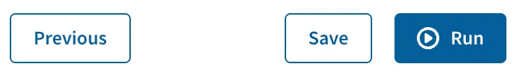
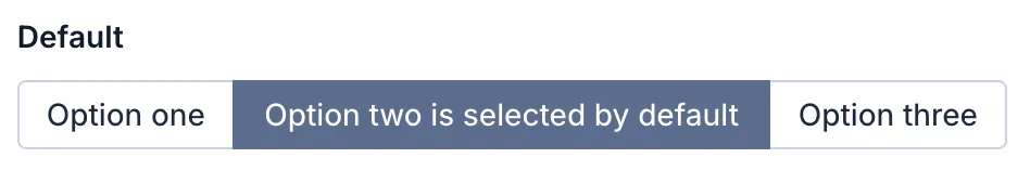
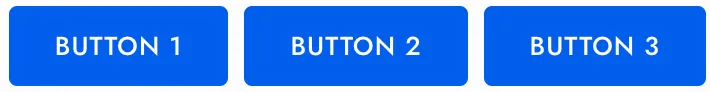
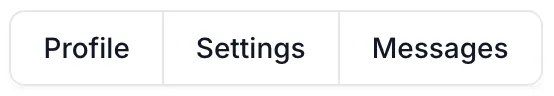
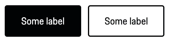
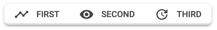
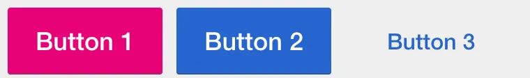
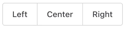
A button group is a wrapper for related buttons; useful if you want to display multiple, related actions together.
Markup
Add the correct role attribute to the button group: e.g. role="group" or role="toolbar", to communicate that the buttons are grouped to users of assistive technologies.
Usage guidelines
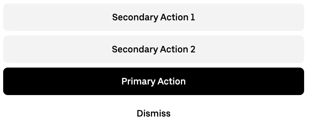
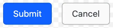
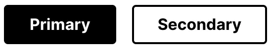
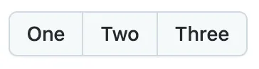
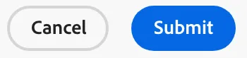
- Use consistent rules for the order of buttons across different button groups. One possible rule is to keep primary actions (e.g. submitting a form) on the right and secondary actions (e.g. cancel, go back) on the left.
Related components
-
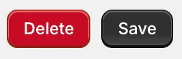
Buttons trigger an action such as submitting a form or showing/hiding an interface component.