A component for displaying nested hierarchical information, such as a table of contents or directory structure.
Component
Tree view
14 Examples (14 shown)
Filter:
-
98.css
Tech
- CSS
Features
- Code examples
- Open source
-
Ant Design
Tech
- React
Features
- Code examples
- Accessibility issues
- Open source
-
Base Web
Tech
- React
- CSS-in-JS
Features
- Code examples
- Usage guidelines
- Open source
-
Blueprint
Tech
- React
- Sass
Features
- Open source
-
Carbon Design System
Tech
- React
- Vanilla JS
- Angular
- Vue
- Svelte
- Web Components
Features
- Code examples
- Usage guidelines
- Open source
-
Clarity Design System
Tech
- CSS
- Angular
- Web Components
Features
- Code examples
- Usage guidelines
- Open source
-
Elastic UI framework
Tech
- React
- CSS-in-JS
Features
- Code examples
- Open source
-
Instructure-UI
Tech
- React
- CSS-in-JS
Features
- Code examples
- Accessibility
- Open source
-
Pajamas
Tech
- Vue
Features
- Usage guidelines
- Code examples
- Open source
-
PatternFly
Tech
- React
- Sass
Features
- Tone of voice
- Open source
- Usage guidelines
-
Primer
Tech
- React
Features
- Code examples
- Open source
-
Quasar Framework
Tech
- Vue
Features
- Accessibility issues
- Code examples
- Open source
-
Spectrum
Tech
- CSS
- Web Components
- React
Features
- Code examples
- Usage guidelines
- Tone of voice
- Open source
-
Web Awesome
Tech
- Web Components
Features
- Open source
- Code examples
Description
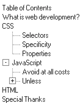
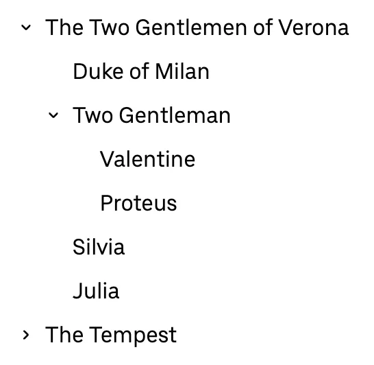
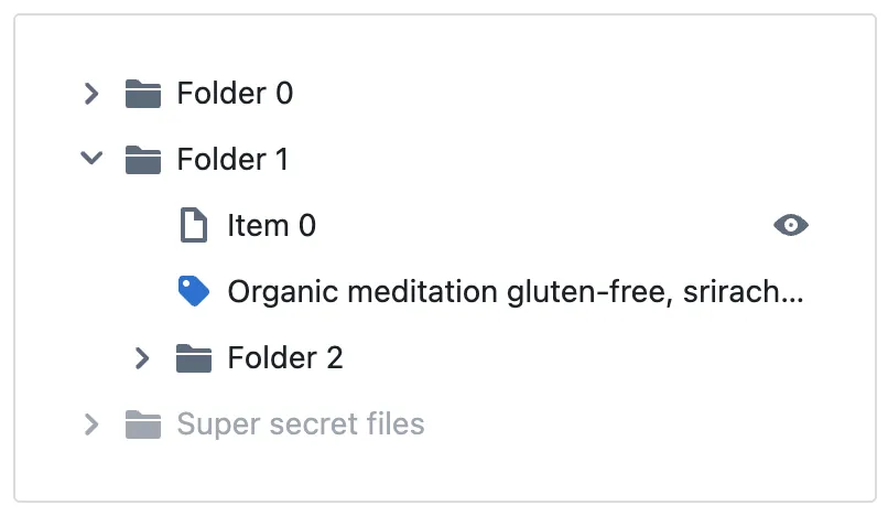
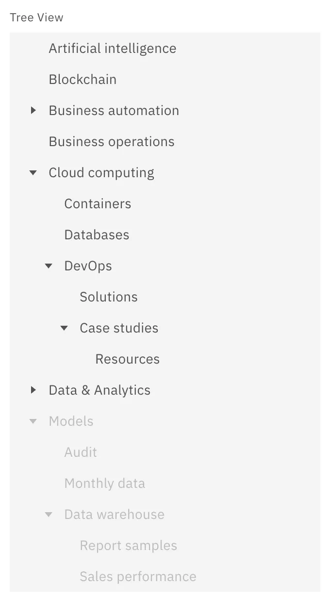
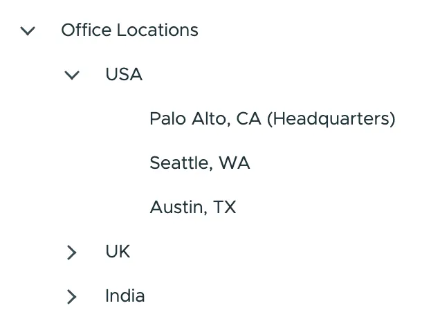
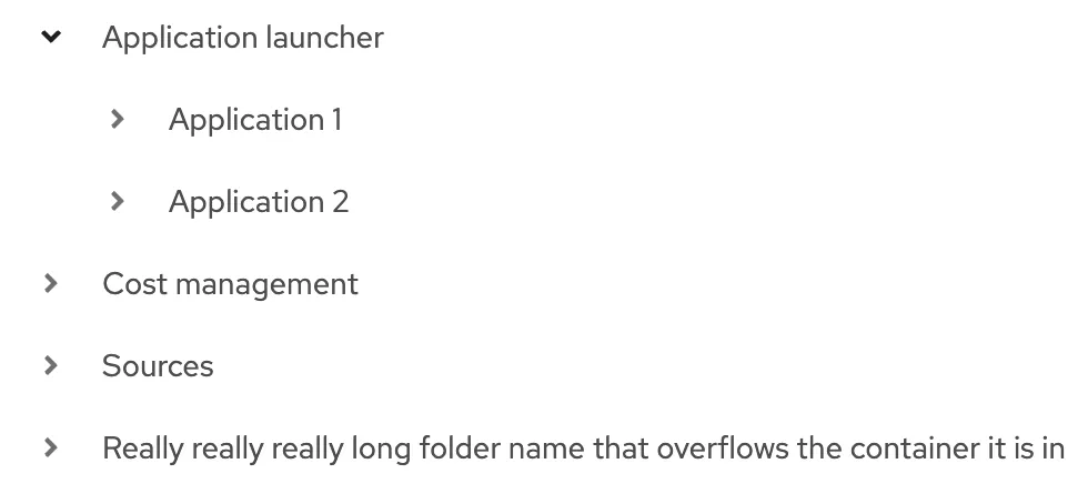
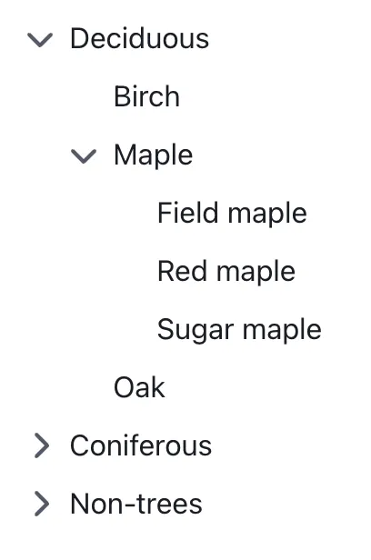
A tree view is a component used to represent hierarchical data. Common use cases include filesystems, taxonomies, and organisational structures. To simplify navigation of complex trees, parent nodes can be expanded and collapsed to show their children.
Markup, Accessibility, and Interactivity
In HTML, a tree view is typically implemented using nested <ul> (unordered list) elements:
<ul>
  <li>Parent Node
    <ul>
      <li>Child Node 1</li>
      <li>Child Node 2</li>
    </ul>
  </li>
</ul>
ARIA attributes
To make a Tree view accessible to users of screen readers and other assistive technology, it must first be enhanced with the addition of some ARIA roles:
- The outermost
<ul>element should be givenrole="tree" - Nested
<ul>elements should be givenrole="group" - All
<li>elements should be givenrole="treeitem"
<ul role="tree">
  <li role="treeitem">Parent Node
    <ul role="group">
      <li role="treeitem">Child Node 1</li>
      <li role="treeitem">Child Node 2</li>
    </ul>
  </li>
</ul>
In addition to roles, the following ARIA attributes are necessary:
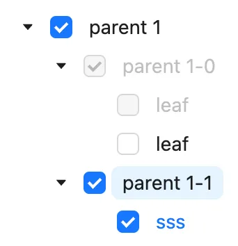
- If the tree supports selection of more than one node at a time, add
aria-multiselectable="true"to the outermost<ul>. - Each
<li>which acts as a parent node (i.e. contains a child<ul>) should havearia-expandedset tofalsewhen collapsed andtruewhen expanded. - If a node is selectable, the state should be indicated with either
aria-selected(if only one node is selectable at a time) oraria-checked(for multi-select trees).
<ul role="tree" aria-label="Example tree">
  <li role="treeitem" aria-expanded="false">Parent Node
    <ul role="group">
      <li role="treeitem">Child Node 1</li>
      <li role="treeitem">Child Node 2</li>
    </ul>
  </li>
</ul>
Interactivity
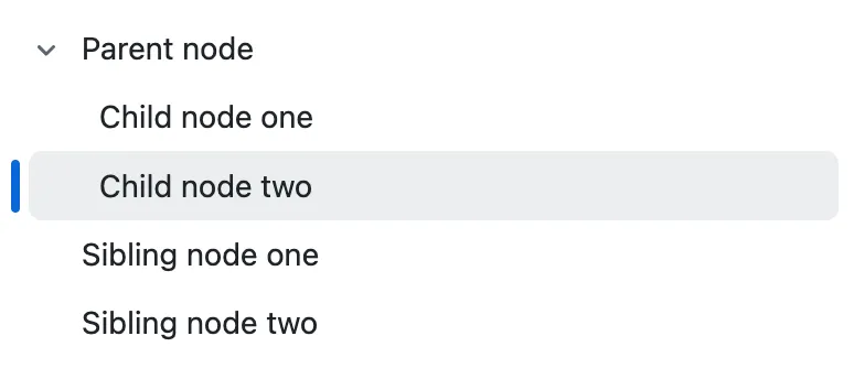
Interactivity depends on whether nodes are selectable or not. For non-selectable nodes, the only interaction is expanding or collapsing the node’s children. For selectable nodes you’ll need to consider both selection and expanding/collapsing the children.
Touch / Mouse
If nodes are selectable, then parent items will need two clickable areas: one to expand/collapse the node and another to toggle the selected state. For nodes that are not selectable, clicking anywhere on the node should trigger the expand/collapse action.
As with any interactive element, ensure the clickable area is large enough. To meet the WCAG 2.2 criterion, 2.5.8 Target Size, the target size must be at least 24 by 24 CSS pixels1.
Keyboard
- ↑ and ↓ to move focus between nodes.
- ← and → to open / close a node; move focus down into child nodes; move focus up to parent node.
- Enter and Space to select the currently focused node.
Usage guidelines
- Don’t use a List view if there’s no nested hierarchy to your data; instead opt for a simpler element such as a List or an Accordion.
- Always include a clear visual indication of whether a node is expanded or collapsed, such as a chevron or plus/minus icons.
- For list views containing a large number of items, a free text filter input can help users find relevant nodes quickly.
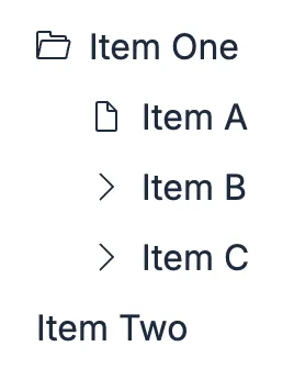
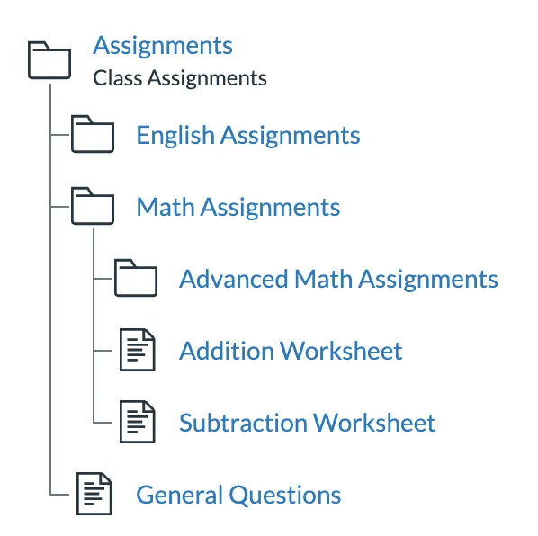
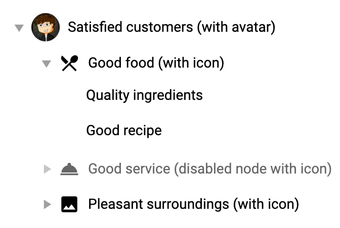
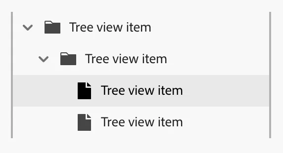
- If your list view contains different types of entity (e.g.: folders and files; files with different extensions), icons can aid with navigation. If there is only a single type of entity in your tree, icons can be unnecessary clutter.
Footnotes
-
“The reference pixel is the visual angle of one pixel on a device with a device pixel density of 96dpi and a distance from the reader of an arm’s length. For a nominal arm’s length of 28 inches, the visual angle is therefore about 0.0213 degrees.” CSS Values and Units Module Level 3, W3C ↩
Resources
-
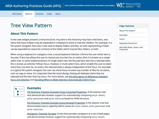
ARIA Authoring Practices Guide (APG)