A means of displaying multiple slides of content, one or more at a time. Navigation between slides can be controlled via swiping, scrolling, or buttons.
Component
Carousel
Also known as: Content slider
22 Examples (22 shown)
Filter:
-

Ant Design
Tech
- React
Features
- Code examples
- Accessibility issues
- Open source
-
Auro
Tech
- Web Components
- Sass
Features
- Code examples
- Usage guidelines
- Open source
-
BBC Global Experience Language
Features
- Accessibility
- Usage guidelines
- Unmaintained
-
Bootstrap
Tech
- Sass
Features
- Code examples
- Accessibility
- Open source
-

Cedar
Tech
- Vue
- Sass
- CSS Modules
Features
- Usage guidelines
- Code examples
- Open source
-
eBay MIND Patterns
Features
- Accessibility
- Usage guidelines
- Open source
-
eBay Playbook
Tech
- HTML
- React
Features
- Code examples
-
Elisa Design System
Tech
- React
Features
- Usage guidelines
- Code examples
- Accessibility
-

Flowbite
Tech
- Tailwind CSS
Features
- Open source
- Code examples
-

Grommet
Tech
- React
Features
- Code examples
- Open source
-

Inclusive Components
Features
- Code examples
- Accessibility
- Unmaintained
-
Lightning Design System
Tech
- React
Features
- Code examples
- Usage guidelines
- Tone of voice
- Open source
-

Material Design
Tech
- Mobile
- Web Components
- Sass
Features
- Usage guidelines
- Open source
- Accessibility
-
Porsche Design System
Tech
- Web Components
- Angular
- React
- Vue
Features
- Code examples
- Open source
-
Quasar Framework
Tech
- Vue
Features
- Accessibility issues
- Code examples
- Open source
-
Sainsbury's Design System
Tech
- React
- Sass
Features
- Usage guidelines
- Code examples
- Tone of voice
-
Sainsbury's Design System
Tech
- React
- Sass
Features
- Usage guidelines
- Code examples
- Tone of voice
-
shadcn/ui
Tech
- React
- Tailwind CSS
Features
- Code examples
- Open source
-
SubZero
Features
- Accessibility issues
-
Thumbprint
Tech
- React
- Sass
Features
- Code examples
- Open source
-

W3C design system
Tech
- Sass
- Vanilla JS
Features
- Code examples
- Usage guidelines
- Open source
- Accessibility
-

Web Awesome
Tech
- Web Components
Features
- Open source
- Code examples
Description
Despite the fact that pixels are free, and scrolling down to view more content is a convention that’s existed for decades, carousels are still a common solution for the perceived problem of having more content to display than there is space available.

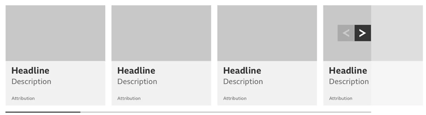
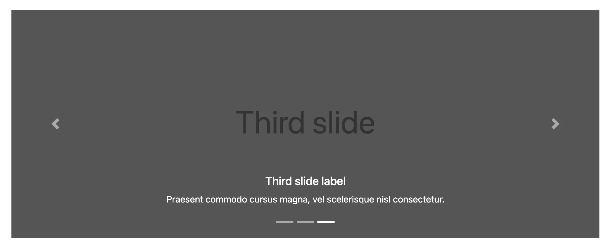
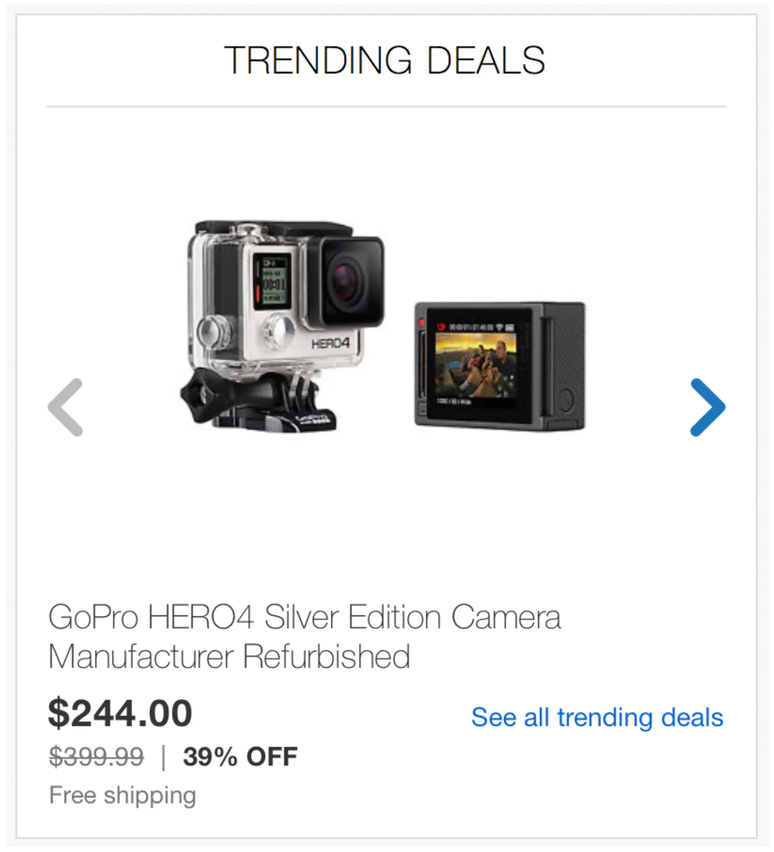
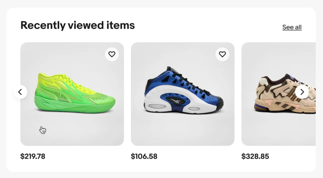
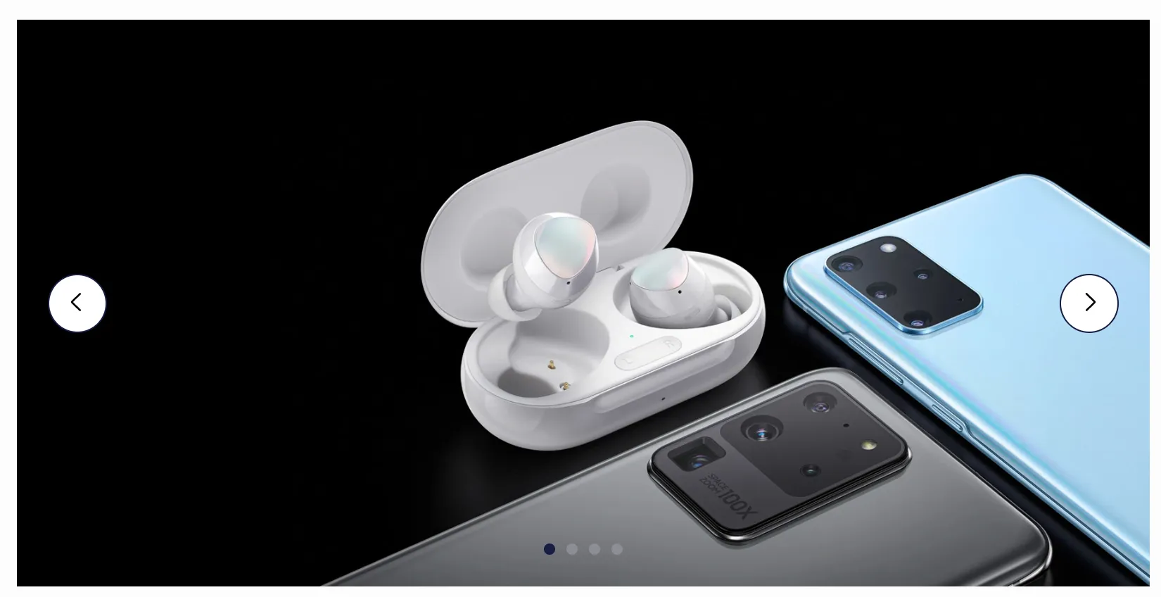
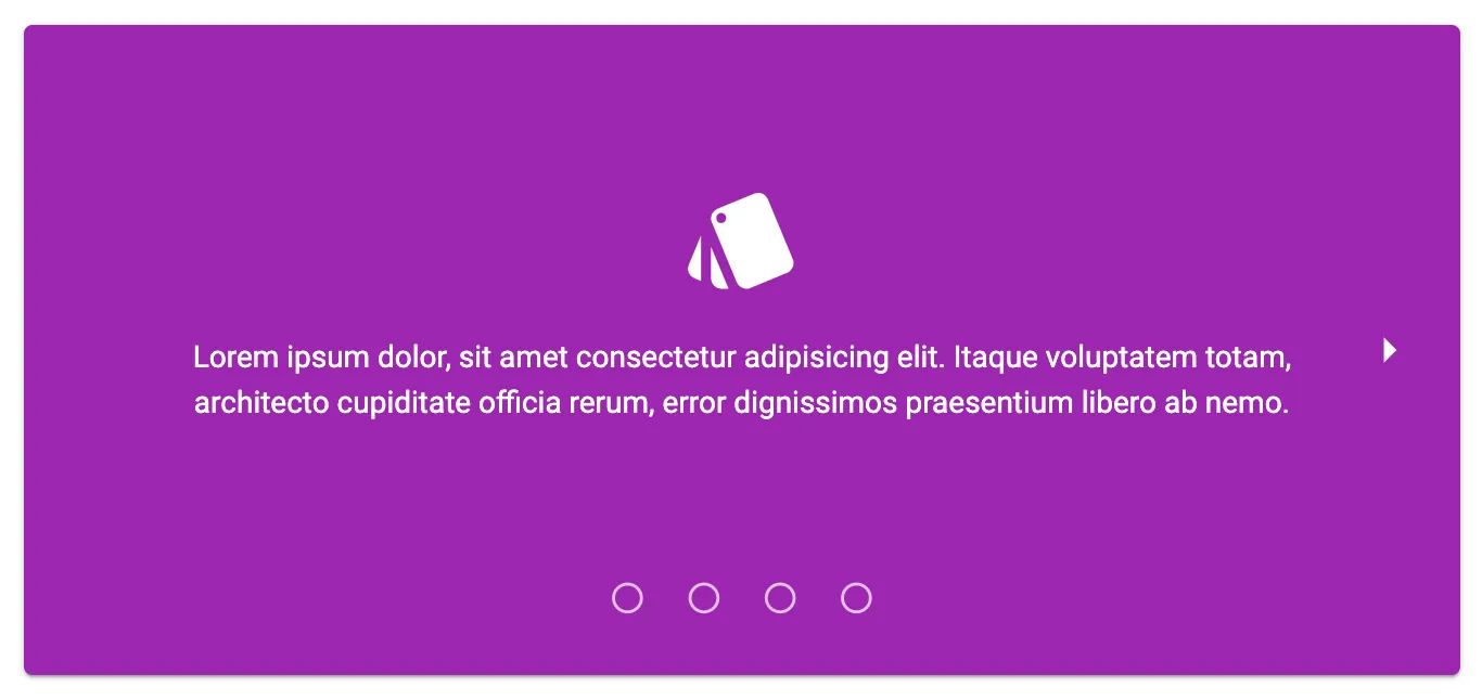
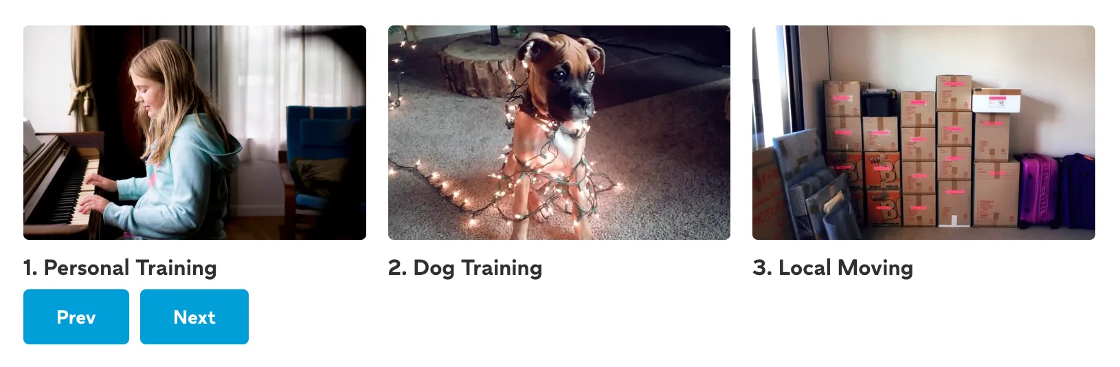
Carousels come in all shapes and sizes but the core functionality is the same: content is split up into slides, and only a single slide or subset of slides are visible at any time.

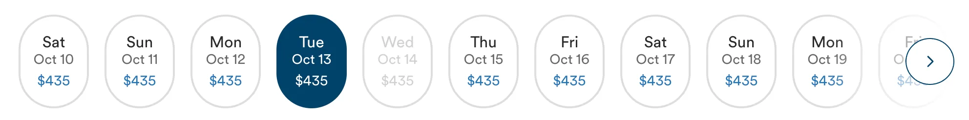
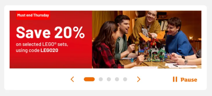
Navigating between slides is accomplished via one or more of the following methods (this list is non-exhaustive):
- Swipe gestures (on touchscreen devices and trackpads)
- Scrolling with a scroll wheel (some mouse wheels offer multiple axes for scrolling, in other cases vertical scrolling is translated to horizontal carousel movement)
- Using the arrow keys on a computer keyboard, directional pad on a game controller, or some other input device with physical buttons.
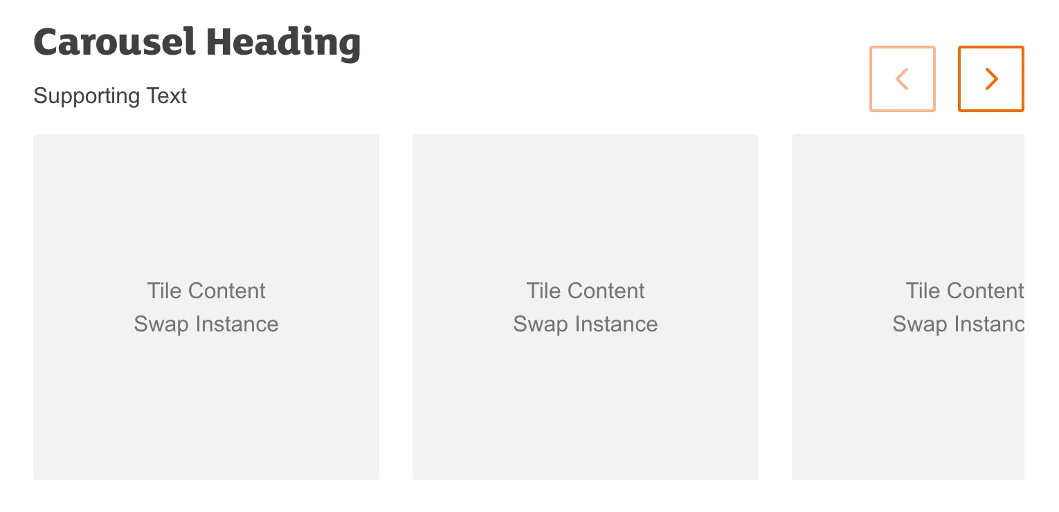
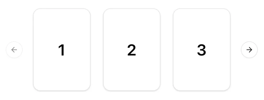
- Clicking or tapping on-screen right and left buttons
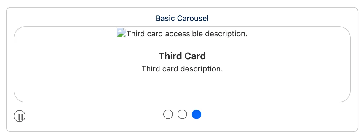
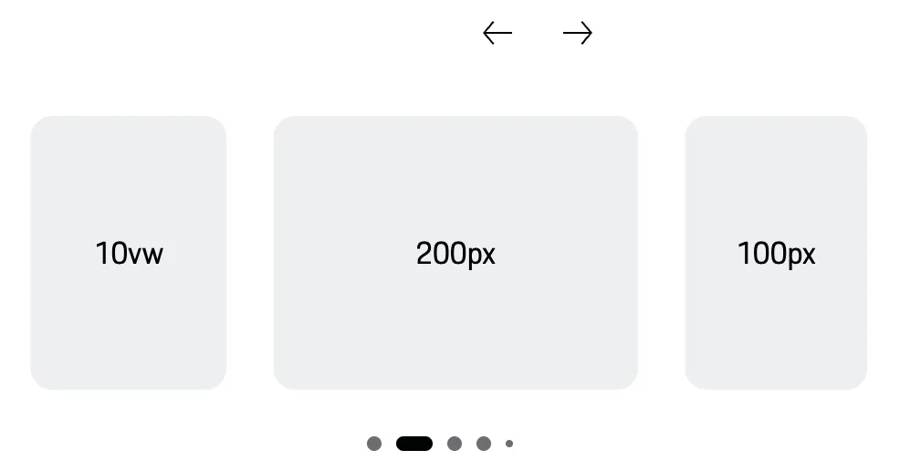
- Clicking on progress dots (a form of pagination) to go to a specific slide
There are also some carousels in which the slides transition automatically without user input.
Note: Just because a component can be scrolled horizontally, doesn’t mean that it’s a carousel1. Horizontal scrolling containers can be useful for displaying information that doesn’t easily fit into a narrow column. e.g. tables, spreadsheets, infographics etc. It can also be a stylistic choice. e.g. on the homepage of the Van Gogh Museum.
Accessibility
Carousels are inherently harder to make accessible than a simpler component, which is why most carousel implementations you’ll find aren’t fully accessible. Even a carousel library which advertises accessibility can be used to build inaccessible carousels.
Without going into too much detail, here are a few of the features and techniques you can use to make your carousels more accessible:
On-screen controls
Always provide on-screen controls for changing carousel slides. You can’t assume that all devices with small screens support touch gestures. Consider users who use a high zoom level2 or control their phone with an alternate input device.

As with all web content, ensure controls meet colour contrast requirements. Pay special attention when controls can appear on top of images: test with a variety of different images to ensure inactive, active, and focused states always have sufficient contrast.
You should also ensure that touch targets are large enough – at least 24px in diameter. Progress dots often fail this criterion.
Hide inactive content
The content of inactive or invisible slides should be hidden from screen readers, and must not be focusable. Use the inert attribute (or a combination of aria-hidden and tabindex="-1") to prevent both tabbing and discoverability.
If your carousel is designed to loop infinitely (i.e. clicking ‘next’ on the last slide takes you back to the first slide) be wary of users getting stuck in focus traps, where they cannot progress beyond the carousel.
Respecting motion preferences
Auto-transitioning carousels are problematic for many reasons: they’re distracting, they ignore variable reading times, and they can cause issues with assistive technology.
If you absolutely must auto-transition between slides, always provide a play/pause control so users can stop this behaviour. You should also prevent the slide from transitioning whenever the cursor is hovering over the carousel or an element within the carousel is focused.
It’s helpful to communicate how long the current side will be visible for – consider including a progress bar or similar visual indicator.
Any transitions between slides should respect users’ motion preferences (on the web check for prefers-reduced-motion).
Styling
You may have seen a recent article and some impressive demos for CSS-only carousels. At the time of writing these are still very much experimental and have a long way to go before they can be considered fully accessible3.
Until then, you’ll have to rely on JavaScript for the bulk of Carousel functionality. However there are some properties which can help minimise the amount of JavaScript required.
CSS Scroll Snap
With the use of CSS Scroll Snap properties, you can restrict the possible scroll positions that a scroll container’s viewport may end at after a scrolling operation has completed. e.g. to centre an element in the viewport or align it to the left hand side.
In the following example, the outer element, .carousel is the scroll container, and .slide is used for children.
.carousel {
  scroll-snap-type: x mandatory;
}

.slide {
  scroll-snap-align: start; /* align to the left edge (for ltr languages) */
}
CSS Logical Properties
If there is any chance your site may be translated into a right-to-left language such as Arabic or Hebrew, you should make use of CSS logical properties.
Usage guidelines
Carousels are rarely the most efficient way for your users to accomplish a task – they‘re a compromise between different requirements. The internal goals of an organisation (or the preservation of some stakeholder’s fragile ego) are frequently prioritised over user needs.
Unfortunately, the decision whether to use a carousel is often out of the hands of an individual designer or developer. In these cases it’s up to those individuals to make the best of a bad situation.
Discoverability
Putting content in a carousel is a surefire way of ensuring a large percentage of users will miss it. Therefore, never use carousels for essential information. There’s a place for exploratory interfaces but these are a rare exception.
Gestures
Allow users of touch devices to change slides with a swipe gesture. Take into account that in some browsers (including iOS Safari) the same gesture might be used for back/forward page navigation – set overscroll-behavior-x: contain (or overscroll-behavior-inline if you’re using CSS Logical Properties) to prevent accidental actions.
Affordances

On websites at least (phone apps are a different matter), horizontal scrolling is far less intuitive than vertical scrolling. Always provide a visual affordance that there’s more content available. For example, by initially showing a part of the next slide, displaying a visible scrollbar, or adding a fade effect to the edge of the scrollable area.
Alternatives
Before using a carousel, always consider other methods of displaying the same content. This can be as simple as laying your content out in a horizontal stack, or if you’re feeling adventurous, a grid.

As an enhancement to a simple thumbnail grid, you can add functionality to expand each image on click. This lets users make an informed choice about what they want to see instead of having to scroll through every slide or waiting for the content they’re interested in to appear. For users who want a more exploratory experience, you can provide next and previous controls once in the expanded view.
If you’re trying to save space by using a carousel, perhaps you should consider an Accordion. These accomplish the same goal of saving space, while also having a couple of big advantages over carousels:
- There’s a native HTML element,
detailswhich allows you to build them in an accessible way with minimal CSS and zero JavaScript. - The heading (or
summaryif you’re using adetailselement) lets you provide users with a summary of the content of each expandable section so they can make an informed choice about whether to expand it.
Lastly, why use a carousel when you can just show less stuff? If it’s important that a certain slide appears first, why not only show that slide and spend the time you would have spent building a carousel on building a simpler and more accessible component?
Footnotes
-
…which is not to say that horizontal scrolling is without its problems, see Horizontal Scrolling Containers Are Not a Content Strategy by Adrian Roselli ↩
-
For users who’ve set a 400% zoom, a 1280px wide screen acts more like a 320px one, see Reflow (Level AA) on WCAG 2.2 Understanding Docs ↩
-
Are ‘CSS Carousels’ accessible? by Sara Soueidan ↩
Resources
-
By Vitaly Friedman
Smashing Magazine
-

By Vitaly Friedman
Smart Interface Design Patterns
-
-
By Robert Flack, Penny McLachlan, Lucas Radaelli
Chrome for Developers